Tuesday, April 26, 2011

Something New - Weekly Quick Bitch Picks

Today, I decided I would make a weekly habit of stalking the shops of my fellow Glitter Bitches Handmade members to see what I'm missing when I rely on the ol' Facebook feeds.  Yep, I realized there was a LOT of stuff I hadn't seen and some things that I'd forgotten about, so I decided to pick three items every week and tell my peeps about them.  Since there are only eight members of our team, I'll also include items from our team shop, from shops of current and previous Guest Artisans and from our Affiliate Members.  This is stuff you will want to know about, trust me.

Without any further introduction, here is the first of what I hope will be MANY Krissi's Weekly Quick Bitch Picks:

GLITTER BITCHES MEMBER, Kim Mayhew's "Loco Folko" Dragon
http://antfarmstudio.artfire.com
GLITTER BITCHES MEMBER, Wenchkin's Dork Dog Magnet
http://wenchcraft.artfire.com
GLITTER BITCHES MEMBER, ArJay's Fuchsia Skullerfly hair clip
http://kisszombies.etsy.com
(coming soon to ArtFire!)
Read more ...

Monday, April 11, 2011

FAQ: You Stole My Idea! ... or did you? (aka Copyright 101)

As I mentioned in my last post on Copyright 101, I have just enough knowledge on the subject to be dangerous.  I am not a lawyer, but an artist who was a contract negotiator and legal analyst in a former life (and who actually enjoys the subject of intellectual property).  Go figure.  While the last entry focused on the artist's rights to protect their creations (in that case, images of paintings), this entry comes at the subject from a different angle - what you cannot claim is your protected intellectual property.


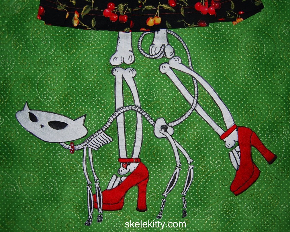
"Welcome Home" (2007) art quilt by Krissi Sandvik
featuring Skelekitty© character created in 2006
ART & IMAGES

Every now and then I get e-mails from fans or friends who are concerned that my character, Skelekitty, may have been used without permission when they see skeleton animals with a similar "vibe" on the internet or in shops.

I always take their concerns seriously since two of my colleagues, Art by Suzi Boneshaker and Queenie of Pocket Full of Posiez (both of whom I adore as artists and as women) had their copies of their art reproduced by a large corporation without permission (*ahem* "stolen").  Luckily, when the blatant copyright infringement was brought the the company's legal department, sale and production of the stolen images ceased.  Not everyone is so lucky, especially when dealing with overseas entities or smaller companies.  So this is no laughing matter, especially now when images are so easy to "borrow" off of the internet.

"Kit" ©Skelanimals, LLC
I have been fortunate so far, since the images that raised concern with my friends have been primarily from the Skelanimals line and not someone actually reproducing Skelekitty illegally.  However, people see a "skele - kitty" and think my idea has been swiped, but here's the thing:


the very idea of a 'cute skeleton animal' is not subject to copyright protection

Let's look at how the Skelekitty / Skelanimals "Kit" designs differ: Skelekitty is a less stylized (more realistic) skeleton than the Skelanimals "Kit" character.  Kit and her Skelanimal pals are rounder, shorter and have just a few bones inside a black body shape.  As you can see, there really isn't any crossover once you get past them both being damn cute skeleton kitties.

skeleton cat
©Ladislao Loera

A day or two back, I received an e-mail from a good friend asking about a skeleton cat by Ladislao Loera (aka "Ladi" / Frenzy Art).  Ladi happens to be one of my favorite artists, so this was a great compliment.  At first glance, Ladi's skeleton cat and Skelekitty have more of a similar look and feel to each other since they are both articulated skeletons with a bright color scheme.  However, they are each recognizable as separate and distinct creations.  Skelekitty is modeled after the long-bodied 1950's kitties where Ladi's skeleton cat looks more like a traditional Día de los Muertos figurine (complete with Frida-esque unibrow!).


Dia de los Muertos cat by Patrick
Murillo, hanging in my art studio
Another skelefied critter Skelekitty has been compared to (and I take it as a HUGE compliment) is by my friend, artist Patrick Murillo (who is on a cruise ship heading toward Mexico with the Crafty Chica Cruise!).  I adore his stuff, having purchased several pieces.  I even have one of his skele-kitty paintings hanging in my art studio!  Again, by glancing at his paintings, it's clear that Patrick's kitties, doggies and skeletons are painted by Patrick while Skelekitty and the Skelecritters are instantly recognizable as "Skelekitty & Friends."

OK, so you get how this works with cartoon skeleton cats (and dogs) now.  What about other stuff?

Late 2012 Update:  Check out this real life example of outright stolen images where an artist reproduced images by two other artists, Jason Levasque (aka Stuntkid) and Marie Killen.  In this case, the original images were art photographs and the "copied" versions were paintings with not-insignificant imagination and talent, but the original work was used without permission or even reference to the original artists.  Although the copying artist swore the copies were homages, the online art community, his agent and his gallery would have none of it - he was drummed off social media and out of representation.


Brooke Van Gory Designs
"Hummingbird" changing set
DESIGN

One of my good friends and a fellow member of the Corporate Rejects team of artisans, Brooke of Brooke Van Gory Designs makes totes, diaper bags and baby accessories (wet bags, changing pads, etc.).  Anybody can sell diaper bags and a lot of handmade sellers do.  What makes Brooke's bags special, besides her incredible attention to detail and excellent construction, is her design.  The bags aren't cut from someone else's pattern - she drafts her own patterns, which are copyrightable.  All of her diaper bags are sewn from her original designs, so, unless she gives permission, no-one else is allowed to sell bags of the same size, shape and with the same features.  Therefore, she would have every right to claim infringement if someone were to make a bag identical to hers.

Are you all with me so far?


Brooke Van Gory Designs "Doodle
Skull" Expedient© diaper bag
Another 'element' that set Brooke's creations apart from most other sellers are the fabrics that she uses.  Most of them (with a few exceptions, like the hand-painted Rocky The Zombie collaboration bags) are constructed using commercially available fabrics with a bit of a 'punk rock mommy' feel to them.  There are LOTS of skulls (really, really cute skulls; and PINK!)!!  Now, while the fabric combinations that Brooke uses are definitely a part of her shop 'signature,' they are NOT something she can copyright.  Remember where we came in with the mere idea of a skeleton cat wasn't subject to copyright protection?  Yep.  We're right back there.


The simple IDEA of putting skulls on baby stuff cannot be and is not protected by copyright.  

It's not infringement, it's good old fashioned American competition!!  Besides, the fabrics are commercially available - heck, as long as I didn't swipe her bag designs, I could go back to sewing and make and sell a ton of baby stuff just swimming in skulls - even the same skull fabrics that Brooke uses.  She could threaten to sue me until she's blue in the face, but it wouldn't make a difference, legally speaking.  Don't worry though, I'm sticking to my painting and letting the seamstress extraordinaire do that thing she does so well.


TITLES

Here's another example of stuff you can't just threaten to sue people over:  I received an e-mail in mid-February from someone threatening me for using the title "Pyrography 101" on a video tutorial (just a little video of my wood burning techniques).  She claimed,

The name is the title of my book & registered domain. Please read the notice at the bottom of my website page regarding the use of the name Pyrography 101 and remove that title from your utube[sic] page. [link removed]
I will check back and if not removed withing the next 24 hours I will proceed with the next step of action to have it taken down and/or legal action.

Okayyyyyy......

Since this woman contacted me anonymously through one of my ArtFire listings, I had to do about 2 minutes of research to find her e-mail.  I responded immediately and told her that while she may indeed have a registered domain in that name, domain registration does not afford her copyright protection and since "101" is a term that has been in common usage for decades, it is not subject to copyright or trademark.  Furthermore, since I had never heard of her, any similarity between the techniques in my video and her book are coincidental or are common practices.  (I also suggested that if perhaps she had used a title that was a little more unique, she wouldn't have felt the need to send legally unsubstantiated threats to people who are providing simple tutorials.)  Just for fun (because I hate bullies), I also looked up YouTube's policies on intentionally mis-reporting copyright infringement and found that they don't like that much, so I told her that if she flagged my video as copyright infringement I would file a counter-claim and provide a copy of my e-mail to YouTube as proof that her claim was both frivolous and harassing.  I never heard from her again.

 UPDATE - April 24th, 2011:  It appears I spoke too soon since I received a comment from @nedraspryro on my YouTube video today (slightly over 24 hours by about 63 days).  It went something like this:
Interesting Pyrography 101 tutorial. A very simplistic outline & nothing more. What is funny is that at the end of your tutorial you state the images & burning are your own & not to steal it. Very funny coming from someone who has stolen the title of someone else's book & online tutorial series entitled "Pyrography 101" to make your own pyrography tutorial. Although titles are not protected by copyright law it is protected by other IP law & you should read the law before using it publicly
She's wrong on a few things here - actually, titles can be covered by copyright law, but not something that is in such common usage as "_______ 101."  She also accuses me of "stealing" her "online tutorial series" which, as I told her in my first response, I'd never seen.  However, I see no point in arguing with someone who's pretty clearly off their nut, so I just sent her a response stating,
I see you created a YouTube account for the express purpose of harassing me again.  Perhaps you forgot my very detailed message to you in February, therefore, it is once again attached below.

As promised, I have reported you to YouTube for harassment and for malicious mis-reporting copyright infringement. I actually have a background in intellectual property law, so perhaps it is YOU who should read the law before publicly and ignorantly accusing people of things which you do not understand fully.

Any further contact from you on this matter will result in additional action on my part, including, but not limited to, contacting publishers, suppliers, internet providers, etc. and advising them that you are harassing me.
And yes, I really did report her to YouTube. You can report anyone who is harassing you by bullying, posting hate speech/rude comments or making threats on YouTube via this link:  http://www.youtube.com/safety_help


*   ☠  *   ♥   *   ☠  *   ♥   *   ☠  *   ♥   *   ☠  *   ♥   *   ☠  *   ♥   *   ☠  *

I hope that this clears up some of the questions that I've been getting lately about what is and isn't copyright infringment and doesn't raise TOO MANY others.  Now feel free to go draw your own skelefied critter or make a baby blanket with skulls on it.  Nobody can stop you as long as you don't do anything naughty.

Oh yeah, and remember that I'm not a lawyer and this doesn't constitute legal advice, kthxbai.
Read more ...

Sunday, April 3, 2011

Color Theory for Non-Artists Part IV - Complementary Colors

Back in February, I started a blog series to help my makeup followers and fans to get a little bit of an artist's eye for pigment colors.


In Part I of this series I talked about the color wheel and even built one of my own from my mineral makeup collection so you could see the spectrum in action.


In Part II, we looked at small chunks of the spectrum around the wheel - colors next to each other on the wheel called analogous colors - and showed how they are great combinations for people just starting out with colorful makeup.


Part III covered hues, tints, tones and shades or, simply, what happens when you add black and/or white to colors.  I showed a technique for an easy but pretty effect using one color and adding black/white to make tints, shades and tones, as well as one using different colors to achieve a 'light to dark' look.


In this portion of the series, I want to tell you about "complementary" colors (not the same as "complimentary" - they're not wandering around telling you how awesome you look in your new hat). In terms of color theory, complementary colors are defined as those that, when mixed in the correct proportions, yield a "neutral" (white, gray, brown or black). I know that's tough to understand unless you're mixing paint colors, so let's look at the color wheel: complementary colors are those that lie opposite each other on the wheel.
Primary/Secondary Complementary colors (Madd Style Cosmetics)
yellow (Princess Buttahcup - disc.) and violet/purple (Electric Kool Aid - disc.)

Primary/Secondary Complementary colors (Madd Style Cosmetics): orange (Boognish) and blue (Aja - ltd. ed.).

Primary/Secondary Complementary colors
 red (MAC ltd. ed. non-vegan red) and green (Madd Style's Zombie Crush - disc.).
So the fact that complementary colors are "opposites" can work both for you and against you.  The inherent contrast between complementary colors makes a strikingly awesome effect.  However, remember up there where we talked about complementary colors mixing to make neutrals (black/brown/grey)? That means if you over-blend contrasting colors, you get something that looks very muddy. Blech.

My suggestion is to stay away from trying to blend or mix complementary colors over each other until you get the hang of it. In the meantime, try using one of these techniques:

♥ Use one color on the lid with its complement on the orbital bone separated by a transitional color (or black) in your crease, like I did with this look:
I separated the green (Ecto Cooler & Frankenstein) from the pink (Magenta)
by adding a little bit of black pigment (Time Warp) in the crease
(pigments by Madd Style Cosmetics)
♥ Use one color on the lid (yellow) and the complement as a liner (purple):
The sharp line of the purple pigment used wet (Electric Kool Aid - disc.) over the dry yellow
(Princess Buttahcup-disc.) keeps the complementary colors from mixing unintentionally
(and again, I used a neutral in the crease to transition the yellow to the purple/pink and again, it's all Madd Style)

♥ Use Danielle's favorite technique for complements - the "cut crease:"
Danielle's "orange and blue" complementary color look with Madd Style Cosmetics' "Dark Crystal" in Citrine (lid) and Sapphire. See more of Danielle's looks at http://genericwhore.blogspot.com

Once you get good at blending techniques, then you can lay the colors down next to each other and create a soft "fade" between the colors without mixing them together (remember? muddy.).
This look could be duplicated with Madd Style Cosmetics' pigments in
Pop Tarte (matte yellow) and Shana (if you got the Jem and the Holograms Collection!)
Just don't forget that complementary colors, when mixed, will turn very muddy (but you can always save your look by adding a little black in the crease!).

You can also use a color with one or more of its "split complements:"
"Split Complements" are a color (purple) and a color *analogous* (next to) its complement. Orange/yellow-orange are analogous to purple's complement (yellow). My favorite color combo, green & purple, are split complements of each other (technically, green/orange/purple are called a "Triad," but for makeup purposes, we don't need to be so specific)
In this look, I used purple with its split complements, green and orange:
Split complements orange (Strange Potion), green (Frankenstein) & purple (Mondo) all by Madd Style.
This Bollywood-inspired look started off was based on orange and its split complements purple and teal (blue green):
"Outsourced to Nirvana" featuring Madd Style Cosmetics Madd Piggiez
Orange (Strange Potion), pink-to transition (Peep Show), purple (Mondo), black-to separate (Oogie Boogie), teal (Nirvana) and a slightly different teal (Ol '55) under lower lashes
Take a look at the Wheel O' Piggies again and then look at your makeup collection. What are some of the colors you have and their complements?  Their split complements?


NEXT: Part V - Mixing It Up!
Read more ...

Color Theory for Non-Artists Part III - Hues, Tints, Shades and Tones

I am writing a series on beginning color theory for my "other" interest, makeup.  Since it's an obvious crossover, I thought I'd post here too.  <3 Krissi  Originally posted at http://www.facebook.com/KrissisMakeup.  Click the badge in the sidebar to follow all of my makeup antics on facebook.

Now that you're familiar with the color wheel (from Part I of this series) and understand analogous colors (defined in Part II of this series), we can learn about creating some very pretty looks by combining tints, shades and/or tones of the same hue.

Scratching your heads over these terms? Don't worry, Krissi will explain.
  • Hue - these are the brightest, purest and most saturated forms of color. In the Wheel O' Piggies, these would be the inside ring of colors.
  • Tint - often referred to as pastels, tints are achieved by adding white to a hue.
  • Shade - shades are achieved by adding black to a color ,but many people will misuse "shade" to mean tints, hues and tones as well.
  • Tone - are grayed out versions of colors and are very popular this year with people really digging the 'smoky eye' look.
Madd Style Cosmetics Madd Piggiez showing examples of hues/tints/shades
Teals: Tron, Ol '55, Vortex / Blues: Aja, Brad, Space Oddity

In this look, I used colors from the Madd Style Cosmetics Rocky Horror collection to go from white in the inner corner to black (liner) with a blue tint, hue and shade in between:
"Columbia Loves Eddie" created using Madd Style Cosmetics Madd Piggiez
from the Rocky Horror Picture Show Collection
Columbia (white), Eddie (blue), Time Warp (black) and Magenta (red-violet)
I started with a blue hue on the right 3/4ths of my lid; I then added white, creating a light blue tint (because a hue + white = tint). I left the blue unblended on the third quarter of my lid and then added black  in the outer "V" to create a dark blue shade (because a hue + black = shade).

Here, this might help a little...

Because this look was done with basically ONE color and adding white or black to it, the pigments blend from one to another seamlessly.  This is a fantastic technique for those of you new to blending - you get a chance to practice and even your "failures" look flawless, and you can try it with purples, greens, pinks.... etc., and can add a grey to create a more subtle "tone" instead of going with a black.

Now, while I created the tint/hue/shade effect in "Columbia Loves Eddie" by actually adding white and black to a single hue, it's not necessary to be so literal.  You can choose premixed colors that appear to your eye to be lighter (tint), darker (shade) or greyed out (tone) than your basic color (hue).

For example:
Pixie (a light purple "tint"), Electric Kool Aid (a pure purple "hue"), Headstrong* (a dark purple "shade")
 with Glitter & Doom in the crease (a greyed out purple "tone")
(All colors by Madd Style Cosmetics except * by Brazen Cosmetics)

To create this effect, I applied four separate pigments as if I had taken a purple and added white, black and grey.  The lavender on the inner third of my lid appears to be lighter than the purple in the center, therefore, for these purposes, we'll say it's a tint.  Likewise with the very dark purple on the outer corner - I didn't really add black to my purple pigment, but it kinda looks like I did.   The purple in the center is fully saturated and bright, so it's a "hue" while the crease color is lighter, but a bit muddy, so it's a "tone."

Makeup is all about effect, so don't worry about being too literal here.

Pretty cool, huh? Now you try! And remember, there aren't really any absolute right answers here. It's just how your eye perceives the relationship between the colors.


Take a look at the inner ring of colors and let's call them, for the sake of discussion, "hues."   Now look at the pigments that radiate out.  How do they look in comparison to the hues? Are they shades (darker), tints (lighter) or tones (lighter, but muddy)?

Go try this with your own makeup collection and practice with a look or two.


NEXT: Part IV - Complementary Colors
Read more ...

Saturday, April 2, 2011

Color Theory for Non-Artists Part II - Analogous Colors

I am writing a series on beginning color theory for my "other" interest, makeup.  Since it's an obvious crossover, I thought I'd post here too.  <3 Krissi  Originally posted at http://www.facebook.com/KrissisMakeup.  Click the badge in the sidebar to follow all of my makeup antics on facebook.

In February, I wrote Part I in a series on Beginning Color Theory for Non-Artists, directed primarily at the 'makeup' crowd, however, it can prove useful to just about anyone wanting to understand color combinations a bit better. In the first installment, I introduced my "color wheel" (The Wheel o' Piggiez!) and defined primary, secondary and tertiary colors.  In this installment, we're moving on to some of my favorite color combos (in painting AND in makeup), analogous colors.

Analogous colors are colors that lie next to each other in the spectrum / on the color wheel:
Analogous (or contiguous) colors in the Wheel o' Piggiez:
blue-green (Tron), green (Frankenstein and yellow-green (Acid Bath)
red (MAC ltd edition), violet/magenta (Magenta) and purple (Electric Kool Aid)
pigments by Madd Style Cosmetics except red (by MAC).
Yellow-green (Ecto Cooler), green (Zombie Crush)
and blue-green/teal (Beautiful Tragedy*)
Pigments by Madd Style Cosmetics
except for Beautiful Tragedy, by Hi-Fi Cosmetics
Analogous colors are an easy way to achieve a perfectly blended look with your colors. Since each color is made using a little bit of the next one, they really can't help but blend together.
Analogous colors in the outer edge and blended upward
(white added to inner edge):
blue (Eddie), blue-violet (Eddie/Electric Kool Aid),
Violet (Electric Kool Aid) and red-violet (Magenta)
Pigments by Madd Style Cosmetics 

You can achieve a great effect with just two analogous colors, so don't feel compelled to start off with four or five. Now go have some fun!

NEXT: Part III - Hues, Tints, Shades and Tones
Read more ...