Showing posts with label color theory. Show all posts

Sunday, April 3, 2011

Color Theory for Non-Artists Part IV - Complementary Colors

Back in February, I started a blog series to help my makeup followers and fans to get a little bit of an artist's eye for pigment colors.


In Part I of this series I talked about the color wheel and even built one of my own from my mineral makeup collection so you could see the spectrum in action.


In Part II, we looked at small chunks of the spectrum around the wheel - colors next to each other on the wheel called analogous colors - and showed how they are great combinations for people just starting out with colorful makeup.


Part III covered hues, tints, tones and shades or, simply, what happens when you add black and/or white to colors.  I showed a technique for an easy but pretty effect using one color and adding black/white to make tints, shades and tones, as well as one using different colors to achieve a 'light to dark' look.


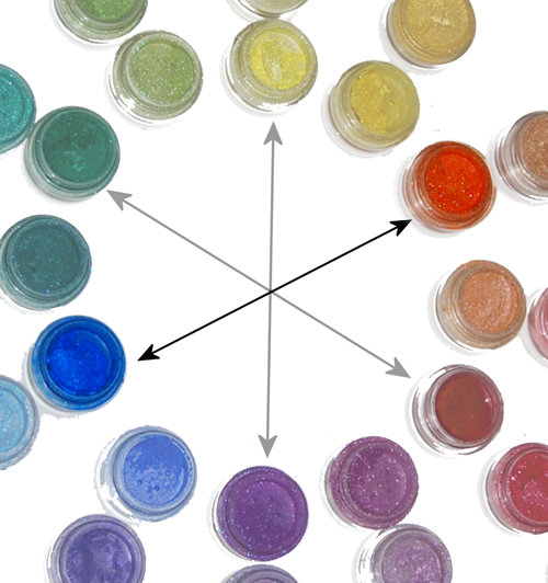
In this portion of the series, I want to tell you about "complementary" colors (not the same as "complimentary" - they're not wandering around telling you how awesome you look in your new hat). In terms of color theory, complementary colors are defined as those that, when mixed in the correct proportions, yield a "neutral" (white, gray, brown or black). I know that's tough to understand unless you're mixing paint colors, so let's look at the color wheel: complementary colors are those that lie opposite each other on the wheel.
Primary/Secondary Complementary colors (Madd Style Cosmetics)
yellow (Princess Buttahcup - disc.) and violet/purple (Electric Kool Aid - disc.)

Primary/Secondary Complementary colors (Madd Style Cosmetics): orange (Boognish) and blue (Aja - ltd. ed.).

Primary/Secondary Complementary colors
 red (MAC ltd. ed. non-vegan red) and green (Madd Style's Zombie Crush - disc.).
So the fact that complementary colors are "opposites" can work both for you and against you.  The inherent contrast between complementary colors makes a strikingly awesome effect.  However, remember up there where we talked about complementary colors mixing to make neutrals (black/brown/grey)? That means if you over-blend contrasting colors, you get something that looks very muddy. Blech.

My suggestion is to stay away from trying to blend or mix complementary colors over each other until you get the hang of it. In the meantime, try using one of these techniques:

♥ Use one color on the lid with its complement on the orbital bone separated by a transitional color (or black) in your crease, like I did with this look:
I separated the green (Ecto Cooler & Frankenstein) from the pink (Magenta)
by adding a little bit of black pigment (Time Warp) in the crease
(pigments by Madd Style Cosmetics)
♥ Use one color on the lid (yellow) and the complement as a liner (purple):
The sharp line of the purple pigment used wet (Electric Kool Aid - disc.) over the dry yellow
(Princess Buttahcup-disc.) keeps the complementary colors from mixing unintentionally
(and again, I used a neutral in the crease to transition the yellow to the purple/pink and again, it's all Madd Style)

♥ Use Danielle's favorite technique for complements - the "cut crease:"
Danielle's "orange and blue" complementary color look with Madd Style Cosmetics' "Dark Crystal" in Citrine (lid) and Sapphire. See more of Danielle's looks at http://genericwhore.blogspot.com

Once you get good at blending techniques, then you can lay the colors down next to each other and create a soft "fade" between the colors without mixing them together (remember? muddy.).
This look could be duplicated with Madd Style Cosmetics' pigments in
Pop Tarte (matte yellow) and Shana (if you got the Jem and the Holograms Collection!)
Just don't forget that complementary colors, when mixed, will turn very muddy (but you can always save your look by adding a little black in the crease!).

You can also use a color with one or more of its "split complements:"
"Split Complements" are a color (purple) and a color *analogous* (next to) its complement. Orange/yellow-orange are analogous to purple's complement (yellow). My favorite color combo, green & purple, are split complements of each other (technically, green/orange/purple are called a "Triad," but for makeup purposes, we don't need to be so specific)
In this look, I used purple with its split complements, green and orange:
Split complements orange (Strange Potion), green (Frankenstein) & purple (Mondo) all by Madd Style.
This Bollywood-inspired look started off was based on orange and its split complements purple and teal (blue green):
"Outsourced to Nirvana" featuring Madd Style Cosmetics Madd Piggiez
Orange (Strange Potion), pink-to transition (Peep Show), purple (Mondo), black-to separate (Oogie Boogie), teal (Nirvana) and a slightly different teal (Ol '55) under lower lashes
Take a look at the Wheel O' Piggies again and then look at your makeup collection. What are some of the colors you have and their complements?  Their split complements?


NEXT: Part V - Mixing It Up!
Read more ...

Color Theory for Non-Artists Part III - Hues, Tints, Shades and Tones

I am writing a series on beginning color theory for my "other" interest, makeup.  Since it's an obvious crossover, I thought I'd post here too.  <3 Krissi  Originally posted at http://www.facebook.com/KrissisMakeup.  Click the badge in the sidebar to follow all of my makeup antics on facebook.

Now that you're familiar with the color wheel (from Part I of this series) and understand analogous colors (defined in Part II of this series), we can learn about creating some very pretty looks by combining tints, shades and/or tones of the same hue.

Scratching your heads over these terms? Don't worry, Krissi will explain.
  • Hue - these are the brightest, purest and most saturated forms of color. In the Wheel O' Piggies, these would be the inside ring of colors.
  • Tint - often referred to as pastels, tints are achieved by adding white to a hue.
  • Shade - shades are achieved by adding black to a color ,but many people will misuse "shade" to mean tints, hues and tones as well.
  • Tone - are grayed out versions of colors and are very popular this year with people really digging the 'smoky eye' look.
Madd Style Cosmetics Madd Piggiez showing examples of hues/tints/shades
Teals: Tron, Ol '55, Vortex / Blues: Aja, Brad, Space Oddity

In this look, I used colors from the Madd Style Cosmetics Rocky Horror collection to go from white in the inner corner to black (liner) with a blue tint, hue and shade in between:
"Columbia Loves Eddie" created using Madd Style Cosmetics Madd Piggiez
from the Rocky Horror Picture Show Collection
Columbia (white), Eddie (blue), Time Warp (black) and Magenta (red-violet)
I started with a blue hue on the right 3/4ths of my lid; I then added white, creating a light blue tint (because a hue + white = tint). I left the blue unblended on the third quarter of my lid and then added black  in the outer "V" to create a dark blue shade (because a hue + black = shade).

Here, this might help a little...

Because this look was done with basically ONE color and adding white or black to it, the pigments blend from one to another seamlessly.  This is a fantastic technique for those of you new to blending - you get a chance to practice and even your "failures" look flawless, and you can try it with purples, greens, pinks.... etc., and can add a grey to create a more subtle "tone" instead of going with a black.

Now, while I created the tint/hue/shade effect in "Columbia Loves Eddie" by actually adding white and black to a single hue, it's not necessary to be so literal.  You can choose premixed colors that appear to your eye to be lighter (tint), darker (shade) or greyed out (tone) than your basic color (hue).

For example:
Pixie (a light purple "tint"), Electric Kool Aid (a pure purple "hue"), Headstrong* (a dark purple "shade")
 with Glitter & Doom in the crease (a greyed out purple "tone")
(All colors by Madd Style Cosmetics except * by Brazen Cosmetics)

To create this effect, I applied four separate pigments as if I had taken a purple and added white, black and grey.  The lavender on the inner third of my lid appears to be lighter than the purple in the center, therefore, for these purposes, we'll say it's a tint.  Likewise with the very dark purple on the outer corner - I didn't really add black to my purple pigment, but it kinda looks like I did.   The purple in the center is fully saturated and bright, so it's a "hue" while the crease color is lighter, but a bit muddy, so it's a "tone."

Makeup is all about effect, so don't worry about being too literal here.

Pretty cool, huh? Now you try! And remember, there aren't really any absolute right answers here. It's just how your eye perceives the relationship between the colors.


Take a look at the inner ring of colors and let's call them, for the sake of discussion, "hues."   Now look at the pigments that radiate out.  How do they look in comparison to the hues? Are they shades (darker), tints (lighter) or tones (lighter, but muddy)?

Go try this with your own makeup collection and practice with a look or two.


NEXT: Part IV - Complementary Colors
Read more ...

Saturday, April 2, 2011

Color Theory for Non-Artists Part II - Analogous Colors

I am writing a series on beginning color theory for my "other" interest, makeup.  Since it's an obvious crossover, I thought I'd post here too.  <3 Krissi  Originally posted at http://www.facebook.com/KrissisMakeup.  Click the badge in the sidebar to follow all of my makeup antics on facebook.

In February, I wrote Part I in a series on Beginning Color Theory for Non-Artists, directed primarily at the 'makeup' crowd, however, it can prove useful to just about anyone wanting to understand color combinations a bit better. In the first installment, I introduced my "color wheel" (The Wheel o' Piggiez!) and defined primary, secondary and tertiary colors.  In this installment, we're moving on to some of my favorite color combos (in painting AND in makeup), analogous colors.

Analogous colors are colors that lie next to each other in the spectrum / on the color wheel:
Analogous (or contiguous) colors in the Wheel o' Piggiez:
blue-green (Tron), green (Frankenstein and yellow-green (Acid Bath)
red (MAC ltd edition), violet/magenta (Magenta) and purple (Electric Kool Aid)
pigments by Madd Style Cosmetics except red (by MAC).
Yellow-green (Ecto Cooler), green (Zombie Crush)
and blue-green/teal (Beautiful Tragedy*)
Pigments by Madd Style Cosmetics
except for Beautiful Tragedy, by Hi-Fi Cosmetics
Analogous colors are an easy way to achieve a perfectly blended look with your colors. Since each color is made using a little bit of the next one, they really can't help but blend together.
Analogous colors in the outer edge and blended upward
(white added to inner edge):
blue (Eddie), blue-violet (Eddie/Electric Kool Aid),
Violet (Electric Kool Aid) and red-violet (Magenta)
Pigments by Madd Style Cosmetics 

You can achieve a great effect with just two analogous colors, so don't feel compelled to start off with four or five. Now go have some fun!

NEXT: Part III - Hues, Tints, Shades and Tones
Read more ...

Thursday, February 24, 2011

Color Theory for Non-Artists Part I: Intro to the Color Wheel

I am writing a series on beginning color theory for my "other" interest, makeup.  Since it's an obvious crossover, I thought I'd post here too.  <3 Krissi  Originally posted at http://www.facebook.com/KrissisMakeup.  Click the badge in the sidebar to follow all of my makeup antics on facebook.

I get a lot of questions about how I choose my color combinations -not only with makeup, but with my art as well. Though I don't look at a physical color wheel every day, I do keep it in mind when deciding on my color combinations. Yes, I know. I already hear you asking, "Krissi, what the heck is this color wheel and how do you use it?" Well, I'm so glad you asked.

Since I'm doing this primarily for makeup, let's use Krissi's Colorful Wheel O' Piggies, shall we?
This fun little tool was put together using 99% Madd Style Cosmetics pigments (only the 'primary red' is MAC - this color contains carmine and therefore isn't vegan and cannot be found in Mo's shop!)

Let's just start out with a basic discussion of color. Primary colors are defined as the three colors which, when their light waves are blended, produce white. Usually when artists think of primaries, they are the colors you use to achieve all other colors. The three primary colors are yellow, red and blue.
There are other shadestints, values and hues of these colors, but we'll save that discussion for their own blog posts.
Primary colors YELLOW (Princess Buttahcup), RED (Brash & Bold by MAC-contains carmine) and BLUE (Aja/Jem Coll. - look for this to MAYBE make an appearance in the permanent collection).


Secondary colors (orange, purple/violet and green) are achieved by mixing two primaries together. Easy peasy lemon squeezy, right?
ORANGE (Boognish) = yellow + red
PURPLE (Electric Kool Aid) = red + blue
GREEN (Frankenstein) = blue + yellow


Tertiary colors are acheived by mixing a primary with one of its own secondary colors:
YELLOW-ORANGE (Blister In The Sun), RED-ORANGE (Strange Potion), RED-VIOLET/fuchsia (Magenta), BLUE-VIOLET/indigo (Nana's Tea Party), BLUE-GREEN/teal (Tron) and YELLOW-GREEN (Acid Bath)


OK! Now we have a basic color wheel with which to work. Before we move forward with using the color wheel, why not go take a look at your pigment/eyeshadows and see if you can determine where on the color wheel your favorites fit. If you need some visual help, try printing out a sample color wheel (just Google "color wheel," click on images and choose the one you like best). There's no shame in a cheat sheet!


NEXT: Part II - Analogous and Complementary Colors
Read more ...