Showing posts with label makeup. Show all posts

Sunday, April 3, 2011

Color Theory for Non-Artists Part IV - Complementary Colors

Back in February, I started a blog series to help my makeup followers and fans to get a little bit of an artist's eye for pigment colors.


In Part I of this series I talked about the color wheel and even built one of my own from my mineral makeup collection so you could see the spectrum in action.


In Part II, we looked at small chunks of the spectrum around the wheel - colors next to each other on the wheel called analogous colors - and showed how they are great combinations for people just starting out with colorful makeup.


Part III covered hues, tints, tones and shades or, simply, what happens when you add black and/or white to colors.  I showed a technique for an easy but pretty effect using one color and adding black/white to make tints, shades and tones, as well as one using different colors to achieve a 'light to dark' look.


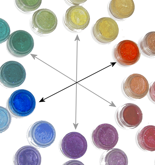
In this portion of the series, I want to tell you about "complementary" colors (not the same as "complimentary" - they're not wandering around telling you how awesome you look in your new hat). In terms of color theory, complementary colors are defined as those that, when mixed in the correct proportions, yield a "neutral" (white, gray, brown or black). I know that's tough to understand unless you're mixing paint colors, so let's look at the color wheel: complementary colors are those that lie opposite each other on the wheel.
Primary/Secondary Complementary colors (Madd Style Cosmetics)
yellow (Princess Buttahcup - disc.) and violet/purple (Electric Kool Aid - disc.)

Primary/Secondary Complementary colors (Madd Style Cosmetics): orange (Boognish) and blue (Aja - ltd. ed.).

Primary/Secondary Complementary colors
 red (MAC ltd. ed. non-vegan red) and green (Madd Style's Zombie Crush - disc.).
So the fact that complementary colors are "opposites" can work both for you and against you.  The inherent contrast between complementary colors makes a strikingly awesome effect.  However, remember up there where we talked about complementary colors mixing to make neutrals (black/brown/grey)? That means if you over-blend contrasting colors, you get something that looks very muddy. Blech.

My suggestion is to stay away from trying to blend or mix complementary colors over each other until you get the hang of it. In the meantime, try using one of these techniques:

♥ Use one color on the lid with its complement on the orbital bone separated by a transitional color (or black) in your crease, like I did with this look:
I separated the green (Ecto Cooler & Frankenstein) from the pink (Magenta)
by adding a little bit of black pigment (Time Warp) in the crease
(pigments by Madd Style Cosmetics)
♥ Use one color on the lid (yellow) and the complement as a liner (purple):
The sharp line of the purple pigment used wet (Electric Kool Aid - disc.) over the dry yellow
(Princess Buttahcup-disc.) keeps the complementary colors from mixing unintentionally
(and again, I used a neutral in the crease to transition the yellow to the purple/pink and again, it's all Madd Style)

♥ Use Danielle's favorite technique for complements - the "cut crease:"
Danielle's "orange and blue" complementary color look with Madd Style Cosmetics' "Dark Crystal" in Citrine (lid) and Sapphire. See more of Danielle's looks at http://genericwhore.blogspot.com

Once you get good at blending techniques, then you can lay the colors down next to each other and create a soft "fade" between the colors without mixing them together (remember? muddy.).
This look could be duplicated with Madd Style Cosmetics' pigments in
Pop Tarte (matte yellow) and Shana (if you got the Jem and the Holograms Collection!)
Just don't forget that complementary colors, when mixed, will turn very muddy (but you can always save your look by adding a little black in the crease!).

You can also use a color with one or more of its "split complements:"
"Split Complements" are a color (purple) and a color *analogous* (next to) its complement. Orange/yellow-orange are analogous to purple's complement (yellow). My favorite color combo, green & purple, are split complements of each other (technically, green/orange/purple are called a "Triad," but for makeup purposes, we don't need to be so specific)
In this look, I used purple with its split complements, green and orange:
Split complements orange (Strange Potion), green (Frankenstein) & purple (Mondo) all by Madd Style.
This Bollywood-inspired look started off was based on orange and its split complements purple and teal (blue green):
"Outsourced to Nirvana" featuring Madd Style Cosmetics Madd Piggiez
Orange (Strange Potion), pink-to transition (Peep Show), purple (Mondo), black-to separate (Oogie Boogie), teal (Nirvana) and a slightly different teal (Ol '55) under lower lashes
Take a look at the Wheel O' Piggies again and then look at your makeup collection. What are some of the colors you have and their complements?  Their split complements?


NEXT: Part V - Mixing It Up!
Read more ...

Color Theory for Non-Artists Part III - Hues, Tints, Shades and Tones

I am writing a series on beginning color theory for my "other" interest, makeup.  Since it's an obvious crossover, I thought I'd post here too.  <3 Krissi  Originally posted at http://www.facebook.com/KrissisMakeup.  Click the badge in the sidebar to follow all of my makeup antics on facebook.

Now that you're familiar with the color wheel (from Part I of this series) and understand analogous colors (defined in Part II of this series), we can learn about creating some very pretty looks by combining tints, shades and/or tones of the same hue.

Scratching your heads over these terms? Don't worry, Krissi will explain.
  • Hue - these are the brightest, purest and most saturated forms of color. In the Wheel O' Piggies, these would be the inside ring of colors.
  • Tint - often referred to as pastels, tints are achieved by adding white to a hue.
  • Shade - shades are achieved by adding black to a color ,but many people will misuse "shade" to mean tints, hues and tones as well.
  • Tone - are grayed out versions of colors and are very popular this year with people really digging the 'smoky eye' look.
Madd Style Cosmetics Madd Piggiez showing examples of hues/tints/shades
Teals: Tron, Ol '55, Vortex / Blues: Aja, Brad, Space Oddity

In this look, I used colors from the Madd Style Cosmetics Rocky Horror collection to go from white in the inner corner to black (liner) with a blue tint, hue and shade in between:
"Columbia Loves Eddie" created using Madd Style Cosmetics Madd Piggiez
from the Rocky Horror Picture Show Collection
Columbia (white), Eddie (blue), Time Warp (black) and Magenta (red-violet)
I started with a blue hue on the right 3/4ths of my lid; I then added white, creating a light blue tint (because a hue + white = tint). I left the blue unblended on the third quarter of my lid and then added black  in the outer "V" to create a dark blue shade (because a hue + black = shade).

Here, this might help a little...

Because this look was done with basically ONE color and adding white or black to it, the pigments blend from one to another seamlessly.  This is a fantastic technique for those of you new to blending - you get a chance to practice and even your "failures" look flawless, and you can try it with purples, greens, pinks.... etc., and can add a grey to create a more subtle "tone" instead of going with a black.

Now, while I created the tint/hue/shade effect in "Columbia Loves Eddie" by actually adding white and black to a single hue, it's not necessary to be so literal.  You can choose premixed colors that appear to your eye to be lighter (tint), darker (shade) or greyed out (tone) than your basic color (hue).

For example:
Pixie (a light purple "tint"), Electric Kool Aid (a pure purple "hue"), Headstrong* (a dark purple "shade")
 with Glitter & Doom in the crease (a greyed out purple "tone")
(All colors by Madd Style Cosmetics except * by Brazen Cosmetics)

To create this effect, I applied four separate pigments as if I had taken a purple and added white, black and grey.  The lavender on the inner third of my lid appears to be lighter than the purple in the center, therefore, for these purposes, we'll say it's a tint.  Likewise with the very dark purple on the outer corner - I didn't really add black to my purple pigment, but it kinda looks like I did.   The purple in the center is fully saturated and bright, so it's a "hue" while the crease color is lighter, but a bit muddy, so it's a "tone."

Makeup is all about effect, so don't worry about being too literal here.

Pretty cool, huh? Now you try! And remember, there aren't really any absolute right answers here. It's just how your eye perceives the relationship between the colors.


Take a look at the inner ring of colors and let's call them, for the sake of discussion, "hues."   Now look at the pigments that radiate out.  How do they look in comparison to the hues? Are they shades (darker), tints (lighter) or tones (lighter, but muddy)?

Go try this with your own makeup collection and practice with a look or two.


NEXT: Part IV - Complementary Colors
Read more ...

Saturday, April 2, 2011

Color Theory for Non-Artists Part II - Analogous Colors

I am writing a series on beginning color theory for my "other" interest, makeup.  Since it's an obvious crossover, I thought I'd post here too.  <3 Krissi  Originally posted at http://www.facebook.com/KrissisMakeup.  Click the badge in the sidebar to follow all of my makeup antics on facebook.

In February, I wrote Part I in a series on Beginning Color Theory for Non-Artists, directed primarily at the 'makeup' crowd, however, it can prove useful to just about anyone wanting to understand color combinations a bit better. In the first installment, I introduced my "color wheel" (The Wheel o' Piggiez!) and defined primary, secondary and tertiary colors.  In this installment, we're moving on to some of my favorite color combos (in painting AND in makeup), analogous colors.

Analogous colors are colors that lie next to each other in the spectrum / on the color wheel:
Analogous (or contiguous) colors in the Wheel o' Piggiez:
blue-green (Tron), green (Frankenstein and yellow-green (Acid Bath)
red (MAC ltd edition), violet/magenta (Magenta) and purple (Electric Kool Aid)
pigments by Madd Style Cosmetics except red (by MAC).
Yellow-green (Ecto Cooler), green (Zombie Crush)
and blue-green/teal (Beautiful Tragedy*)
Pigments by Madd Style Cosmetics
except for Beautiful Tragedy, by Hi-Fi Cosmetics
Analogous colors are an easy way to achieve a perfectly blended look with your colors. Since each color is made using a little bit of the next one, they really can't help but blend together.
Analogous colors in the outer edge and blended upward
(white added to inner edge):
blue (Eddie), blue-violet (Eddie/Electric Kool Aid),
Violet (Electric Kool Aid) and red-violet (Magenta)
Pigments by Madd Style Cosmetics 

You can achieve a great effect with just two analogous colors, so don't feel compelled to start off with four or five. Now go have some fun!

NEXT: Part III - Hues, Tints, Shades and Tones
Read more ...

Thursday, February 24, 2011

Color Theory for Non-Artists Part I: Intro to the Color Wheel

I am writing a series on beginning color theory for my "other" interest, makeup.  Since it's an obvious crossover, I thought I'd post here too.  <3 Krissi  Originally posted at http://www.facebook.com/KrissisMakeup.  Click the badge in the sidebar to follow all of my makeup antics on facebook.

I get a lot of questions about how I choose my color combinations -not only with makeup, but with my art as well. Though I don't look at a physical color wheel every day, I do keep it in mind when deciding on my color combinations. Yes, I know. I already hear you asking, "Krissi, what the heck is this color wheel and how do you use it?" Well, I'm so glad you asked.

Since I'm doing this primarily for makeup, let's use Krissi's Colorful Wheel O' Piggies, shall we?
This fun little tool was put together using 99% Madd Style Cosmetics pigments (only the 'primary red' is MAC - this color contains carmine and therefore isn't vegan and cannot be found in Mo's shop!)

Let's just start out with a basic discussion of color. Primary colors are defined as the three colors which, when their light waves are blended, produce white. Usually when artists think of primaries, they are the colors you use to achieve all other colors. The three primary colors are yellow, red and blue.
There are other shades, tints, values and hues of these colors, but we'll save that discussion for their own blog posts.
Primary colors YELLOW (Princess Buttahcup), RED (Brash & Bold by MAC-contains carmine) and BLUE (Aja/Jem Coll. - look for this to MAYBE make an appearance in the permanent collection).


Secondary colors (orange, purple/violet and green) are achieved by mixing two primaries together. Easy peasy lemon squeezy, right?
ORANGE (Boognish) = yellow + red
PURPLE (Electric Kool Aid) = red + blue
GREEN (Frankenstein) = blue + yellow


Tertiary colors are acheived by mixing a primary with one of its own secondary colors:
YELLOW-ORANGE (Blister In The Sun), RED-ORANGE (Strange Potion), RED-VIOLET/fuchsia (Magenta), BLUE-VIOLET/indigo (Nana's Tea Party), BLUE-GREEN/teal (Tron) and YELLOW-GREEN (Acid Bath)


OK! Now we have a basic color wheel with which to work. Before we move forward with using the color wheel, why not go take a look at your pigment/eyeshadows and see if you can determine where on the color wheel your favorites fit. If you need some visual help, try printing out a sample color wheel (just Google "color wheel," click on images and choose the one you like best). There's no shame in a cheat sheet!


NEXT: Part II - Analogous and Complementary Colors
Read more ...

Monday, December 13, 2010

Falling In And Out Of Love (Denouncing Glittersniffer Cosmetics)

The following post was original written for my personal facebook profile yesterday.  However, since that profile is not public and I have several blog readers who also follow my hair and makeup recommendations, I am reposting it here.

Falling in and out of love (or, "dude, it's only make-up")
by Krissi Sandvik on Sunday, December 12, 2010 at 3:58pm


You know that awesome feeling you get when you find something special that you really love and you want to tell EVERYONE you know about it? I have; you know I have. You've even seen it if you follow any of my blogs, videos or even just my facebook status. Just a few things that you may have seen me fall in love with over the past 5 years include Hina's Tea (oh how sad I was when they closed their doors!), Golden brand's acrylic gel medium and fluid acrylic paints, Special Effects hair color, driving, wood burning, Moleskine journals... and Glittersniffer Cosmetics.

Three different formulations of Glittersniffer's pigment "A.D.D."
Notice the unblended chunks of pigment in the far right swatch,
typical of almost all of the pots I received in the last 3 or 4 months.
I have fallen out of love with only one of the above brands/items, Glittersniffer Cosmetics, and I am sad to say that it is not because I found something better, different or that I lost interest in all similar products. It is due, very simply, to the company losing sight of who and what made it so wonderful in the first place. I was quietly retreating, but when several of my friends sent me messages saying they purchased from Glittersniffer because I used her product, I decided to speak my mind. And so, dear friends and fans, I will no longer recommend Glittersniffer Cosmetics to you.

Specifically, I experienced a growing number of the following problems as Glittersniffer grew over the last six months:
Two jars in my "mattes" collection (too chalky to use) arrived
completely open; sifter was improperly inserted, preventing
lid from being secured. My final three orders (which were incorrect)
arrived with open jars and pigment spilled all over the box/envelope.
  • incorrect orders / incorrect "replacement" orders
  • substituted items without notice or option for refund
  • items never sent / "lost" packages
  • accepting payment for items out of stock offering only store credit (not refund); credit required to be used in conjunction with another order
  • inconsistency in formulations (visibly noticeable from batch to batch)
  • poorly mixed or unmixed pigments (aka "chunks" of color and chalky pigments)
  • multiple attempts at communications ignored
  • broken / open / unsecured jar lids
  • blaming others for errors and lost packages
I personally experienced all of these issues on multiple occasions and even brought these issues to the owner's attention, again on multiple occasions. I understand that running a small business is difficult and that mistakes happen. I run a small business and of course, I have made mistakes. However, I do my best to ensure that they never happen twice. I have turned away work if I feel overwhelmed or am unable to fulfill obligations to existing customers. In the case of Glittersniffer, I would receive an apology, sometimes a product I did not need or want and then it was back to business as usual on the next order. After my last 8 or 10 orders, I started to suspect that maybe this was a pattern.

I am not qualified to say that every experience was like mine (though I can assure you that this issue is quite wide-spread throughout at least 25 of her very long-term customers), nor am I telling you to boycott her items. However, I will say that if you do purchase, I hope that you do it of your own accord and not based on any recommendation I may have made in the past.

There are MANY cosmetics companies out there - some which are also 'cottage industry' businesses - from whom you might wish to purchase. Here is a very small list of companies from whom I have purchased in the past and with whom I continue to be happy (just type the names into Google - you can find them very easily):
  • Madd Style Cosmetics (new company this year)
  • Hi-Fi Cosmetics
  • Medusa's Make Up
  • Alima
  • Aromaleigh Cosmetics (no longer in business)
And I added another to my "faves" list in March 2011:
  • Brazen Cosmetics

Other companies from whom I have not personally purchased, but about whom I have heard good things:
  • Pure Luxe Cosmetics Fell prey to Glittersniffer Syndrome and is selling glow in the dark pigments (updated 3/28/2011)
  • Beauty From The Earth
  • Detrivoire Cosmetics
  • The All Natural Facekept her shop open during a 4-week absence, selling items not in stock (3/28/2011)
  • Shiro Cosmetics
  • Sugar Pill Cosmetics
  • Elohi Cosmetics - noted here for good product, but mixed reviews on customer service admitted to allowing people to smoke in enclosed space with product ingredients and packaging (3/29/2011)
    and, of course, there's
  • TKB Trading for bulk purchases and supplies
The 2-5 week turnaround time is the only reason Fyrinnae is not on this list. I understand why the production time is so long, but it's tough to recommend a company who takes that long to ship.

One final note: This is a description of my experiences only, and you are free to disagree. However, please keep your comments here civil and to the point. I know I may lose "friends" over this, but frankly, if I do, my response will be "it's only makeup and they clearly weren't my friends."

------------

Update (12/13/2010 - 2:20pm):  Yesterday, I set out to write a simple, clear post with the single purpose of letting my friends know that I had experienced ongoing and unaddressed problems with a company and was removing my recommendation.  I assure everyone that I had no idea the issue was so widespread or ran so deep.  While I did NOT set out to defame anyone or to bring anyone down, I cannot apologize for the avalanche this first post started since all I did was state a few facts about my personal experiences.  I cannot control that others had similar experiences as well.


With that said, while I empathize with everyone's anger and disappointment, I also request that you keep your comments constructive and restrain the urge to name-call others on this post (you can call me whatever names you like).  I'm not asking you to edit yourselves, just to post those more "subjective" expressions elsewhere so the point of this post stays on topic: the removal of my endorsement.


Thanks everyone.


Read more ...

Tuesday, October 5, 2010

Make-Up Quickie (Blog Version): Brush Cleaner Recipes & Tips 'N' Hints!

I don't care if you clean your room, but you MUST clean your makeup brushes after every use.  However, it's not necessary to do a full wash every single day unless you are a professional makeup artist using your tools on others!  I usually wash my brushes (full scrubby wash with soap and warm running water) once a week if I wear makeup every day.

For between applications cleaning, I use a liquid brush cleaner which I spritz onto a clean white towel or directly onto the bristles and then wipe off my brush.  For stubborn or deep pigments (reds, blacks, some dark blues) I saturate the brush by dipping it half-way up the bristles into a small container with some cleanser and then squeeze the bristles in a clean towel or washcloth.

I'll tell you a secret.  Brush cleaners are EXPENSIVE and they're really no magic in them, so instead of using a commercial brush cleaner, I choose to make my own and spend my samoleans on MAKEUP!  Here are two of my personal favorite recipes:


Recipe #1: Krissi's First Brush Cleaner:
I've been using this recipe for months and LOVE it.

  • 1 Cup distilled or purified water
  • ¼ Cup isopropyl (rubbing) alcohol (70% or 90%)
  • 1 Tablespoon Dawn dish washing liquid
  • 1 Tablespoon leave-in spray conditioner (any brand)
  • 4-8 drops cold pressed lavender essential oil (do NOT use perfume oil or any other scented oil besides natural essential oil)

Pour water and alcohol into a clean glass dish.  Do not use unfiltered or tap water as bacteria could grow in that over time.  Add soap(s) & conditioner and stir gently with a clean utensil.  Add lavender oil until your preferred scent is achieved (lavender oil will act as an antimicrobial/antibacterial agent AND make your brushes smell pretty).  If the smell is stronger than you like, leave the product open for a few hours and the smell will dissipate.  Fill a small spray bottle (you will have LOTS of cleaner - just store the leftover in a clean container - I save my eye makeup remover bottles and clean them out).


Recipe #2: Gentle & Easy Brush Cleaner:
I found this recipe from Gina of Great Minds Shop Alike on YouTube - here is her original recipe:
  • ½ Bottle (8 oz.) Cetaphil (or Generic Version) - Cetaphil replaces both distilled water and leave-in conditioner
  • ¼ Cup Isopropyl (90%) or Ethyl (70%) Alcohol
  • ½ Tbsp. Shampoo
  • ½ T. Dish washing Soap
Mix in the same manner as previous recipe.  You may wish to put this in a spray bottle for daily use or, if the Cetaphil is too thick for your sprayer, in a pump bottle for convenience. I've been meaning to try this one out for a while and am making a batch TONIGHT!

***********
January 9, 2011: UPDATE!  I have been using the "Great Minds" recipe and LOVE it!  It's my new HG brush cleaner.  However, I tweaked the recipe just a bit and keep it in a spray bottle (the original recipe was a bit thick for that).  


Recipe #3: Krissi-fied version of the conditioning daily brush cleaner


  • ½ Bottle (8 oz./1 Cup) Cetaphil (or Generic Version) - Cetaphil replaces both distilled water and leave-in conditioner
  • ½ Cup Isopropyl (90%) or Ethyl (70%) Alcohol
  • 1 Cup distilled or purified water
  • ½ Tbsp. Shampoo
  • ½ T. Dish washing Soap
  • 10-12 drops cold pressed lavender essential oil
***********

Removing creams, concealers and stubborn piggies from synthetic brushes:  I know, I told you all to blend your NYX jumbo eye crayons and bases with a concealer brush, but didn't tell you how to get that junk OUT of your brush (especially if you've used black crayon - eep!).  Well, just put a little of your usual eye makeup remover (I like the 2-part oil-free kind from Neutrogena, myself) into a spray bottle and clean your 'greasy' brushes with this product first, then with your other brush cleaner.  That's a tip that seems totally obvious to me now, but I didn't figure it out on my own - I learned it from the fabulous Cora at Vintage or Tacky!

That's it!  For more makeup quickies, visit my makeup & hair page on Facebook.
Read more ...