

In Part I of this series I talked about the color wheel and even built one of my own from my mineral makeup collection so you could see the spectrum in action.
 In Part II, we looked at small chunks of the spectrum around the wheel - colors next to each other on the wheel called analogous colors - and showed how they are great combinations for people just starting out with colorful makeup.
 Part III covered hues, tints, tones and shades or, simply, what happens when you add black and/or white to colors. I showed a technique for an easy but pretty effect using one color and adding black/white to make tints, shades and tones, as well as one using different colors to achieve a 'light to dark' look.
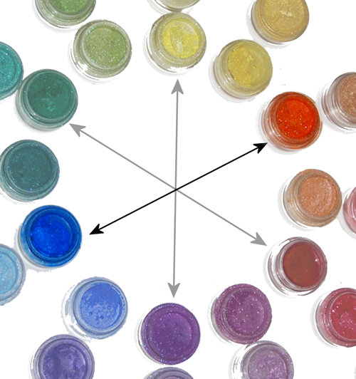
In this portion of the series, I want to tell you about "complementary" colors (not the same as "complimentary" - they're not wandering around telling you how awesome you look in your new hat). In terms of color theory, complementary colors are defined as those that, when mixed in the correct proportions, yield a "neutral" (white, gray, brown or black). I know that's tough to understand unless you're mixing paint colors, so let's look at the color wheel: complementary colors are those that lie opposite each other on the wheel.
 |
| Primary/Secondary Complementary colors (Madd Style Cosmetics) yellow (Princess Buttahcup - disc.) and violet/purple (Electric Kool Aid - disc.) |
 |
| Primary/Secondary Complementary colors (Madd Style Cosmetics): orange (Boognish) and blue (Aja - ltd. ed.). |
 |
| Primary/Secondary Complementary colors red (MAC ltd. ed. non-vegan red) and green (Madd Style's Zombie Crush - disc.). |
My suggestion is to stay away from trying to blend or mix complementary colors over each other until you get the hang of it. In the meantime, try using one of these techniques:
♥ Use one color on the lid with its complement on the orbital bone separated by a transitional color (or black) in your crease, like I did with this look:
 |
| I separated the green (Ecto Cooler & Frankenstein) from the pink (Magenta) by adding a little bit of black pigment (Time Warp) in the crease (pigments by Madd Style Cosmetics) |
 |
| The sharp line of the purple pigment used wet (Electric Kool Aid - disc.) over the dry yellow (Princess Buttahcup-disc.) keeps the complementary colors from mixing unintentionally (and again, I used a neutral in the crease to transition the yellow to the purple/pink and again, it's all Madd Style) |
♥ Use Danielle's favorite technique for complements - the "cut crease:"
 |
| Danielle's "orange and blue" complementary color look with Madd Style Cosmetics' "Dark Crystal" in Citrine (lid) and Sapphire. See more of Danielle's looks at http://genericwhore.blogspot.com |
Once you get good at blending techniques, then you can lay the colors down next to each other and create a soft "fade" between the colors without mixing them together (remember? muddy.).
 |
| This look could be duplicated with Madd Style Cosmetics' pigments in Pop Tarte (matte yellow) and Shana (if you got the Jem and the Holograms Collection!) |
You can also use a color with one or more of its "split complements:"
 |
| "Split Complements" are a color (purple) and a color *analogous* (next to) its complement. Orange/yellow-orange are analogous to purple's complement (yellow). My favorite color combo, green & purple, are split complements of each other (technically, green/orange/purple are called a "Triad," but for makeup purposes, we don't need to be so specific) |
 |
| Split complements orange (Strange Potion), green (Frankenstein) & purple (Mondo) all by Madd Style. |
 |
| "Outsourced to Nirvana" featuring Madd Style Cosmetics Madd Piggiez Orange (Strange Potion), pink-to transition (Peep Show), purple (Mondo), black-to separate (Oogie Boogie), teal (Nirvana) and a slightly different teal (Ol '55) under lower lashes |
NEXT: Part V - Mixing It Up!
No comments:
Post a Comment