Showing posts with label tips. Show all posts

Thursday, March 7, 2013

Tips N Tricks: Fixing Resin "Oopsies"

Hi all!  I know a lot of you have read my "not-really-a-tutorial" on how I make my pendants because I've gotten some great feedback from you.  As an addendum, here's a tip/trick for when good pours go bad (and how I fix them).

Sometimes, no matter how careful I am, some resin will spill over the edge of my glass tile and adhere to the front.
You can see where the resin spilled over the edge and onto the
front of this glass tile (which will be an art pendant for my friend Jenn!)
 If the spillover is thick enough, it can be peeled off cleanly and with relative ease after about 12 hours of curing time (the resin will be dry, but still pliable).  If only a tiny amount of resin has gotten on the front of the glass, it leaves a cloudy residue that doesn't peel up.

Don't use anything abrasive - it might scratch or damage the glass tile.  Do this instead:
Rubbing alcohol is your friend when you're working with sticky resin!
  • Soak a cotton pad, folded paper towel or rag with rubbing (isopropyl 70 or 90%) alcohol
  • Set the tile face-down into the soaked pad and allow it to sit for a few minutes 
  • Gently rub the surface with a paper towel to remove the softened resin (if you notice the resin isn't dissolving, add more alcohol to your pad and start over)
  • Be very careful not to get alcohol onto the finished resin coating the back, and only hold the tile by the edges so you don't press fingerprints into the resin which still may be soft
With some patience, the alcohol, and some gentle rubbing with your fingernails and the paper towel, the unwanted residue will come right off the glass.
Now the glass tile is so shiny, you can see my
yard reflected in it.  Yay!
The resin on the back needs to cure for another 12-72
hours, and then I can add a bail and ship the pendant

I hope this little tip helps.  Be sure to check around for more of my tips and tutorials (there are links at the top of my blog) if you want to know more about mixing resin or sealing paper before pouring resin.  There are also tutorials on crafts and various techniques I use in my paintings.  Enjoy!
Read more ...

Monday, July 23, 2012

Most Requested List: Image Transfer Tutorial (inkjet transparency version)

Without a doubt, my packing tape image transfer tutorial is the most popular post on this blog. Now, after more than two years, I bring you the inkjet transfer version!

This is a fun, relatively clean and VERY quick way to transfer digital images onto your canvas/wood/paper surface - or any flat surface really, assuming you prep and seal it appropriately.  It's pretty easy to do with just a little bit of practice too.

What you will need:
Choose an image.  Be sure you are using an image without copyright restrictions - even if you aren't selling your work, it doesn't mean you can use a copyrighted image.  Likewise, just because you purchased a printed image, it doesn't necessarily give you the right to reproduce it.  Look for very old graphics or images with a creative commons license that matches your purpose.  If you aren't sure, ask; if you can't ask, find another image.  NEVER use another artist's work without permission (especially if it's mine, heh).   

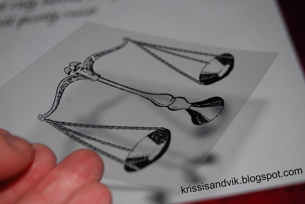
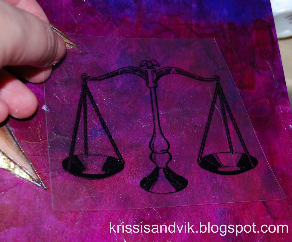
Prepare your image.  I am using this black and white of a balance scale for my current painting.  Print your image onto the inkjet transparency film's rough side.  The rough side is coated with a substance that grabs onto and holds the ink and which will be transferred onto your artwork.  If you print on the slick, uncoated side, you're going to end up with a smeary mess.  Trim out the image you want to transfer.
If you look closely, you can see the coating on the plastic film
(it looks and feels a little like etched glass)
VERY IMPORTANT NOTE:  you will be "flipping" or reversing the transparency onto the surface, so it will appear mirrored.  If the image you have chosen has text or anything directional in it, you will need to set your printer to mirror print, or edit your image before printing.  As it is, this balance scale is ... well ... "balanced," so I don't need to do that here.

I always do a quick dry-fitting before sticking anything down!

Apply the liquid acrylic medium.  Paint some of the fluid medium onto your canvas.  How much acrylic medium you apply will depend on the porosity of your substrate.  You want to use as little medium as possible, which still making sure that all of the image is completely moistened.  

Since I am working on pre-painted wood with a layer of dry gel medium on it, the substrate will not absorb much, if any of the acrylic medium.  If I were working on unfinished wood or watercolor paper, both of which are more absorbent, I would need more medium.

If you use too much medium, the inkjet coating will break down and your transfer will blur (see below).  If you use too little, you will not have contact between the coating/printed image and your substrate.  Getting it right takes practice.

Apply the image.  Place the image, printed side (rough side) down onto surface coated with a thin layer of acrylic medium and press quickly and gently to remove any air bubbles from under the printed areas.

Work quickly and don't press too hard of "burnish" the image.

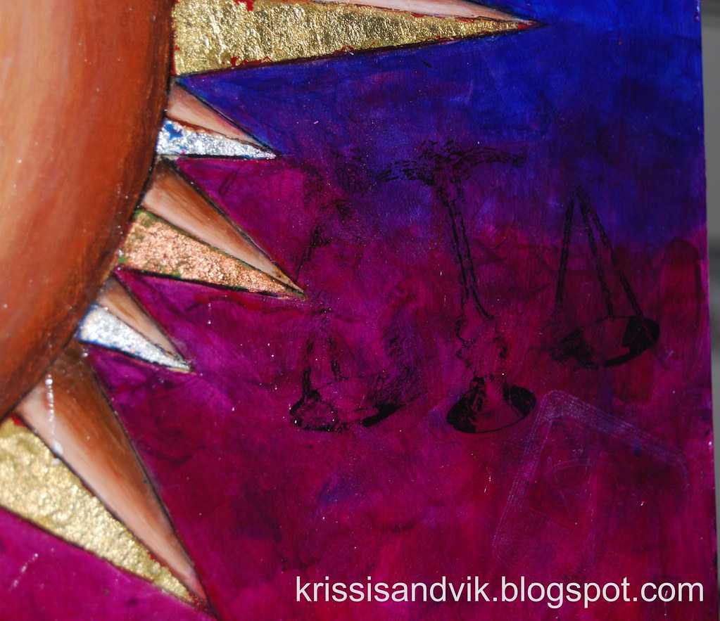
This transfer had a little too much medium on the left and was overworked on the right.
Once the inkjet coating is fully wet, it breaks down under the slightest pressure.
Unless you're like me and like the "distressed" look, it's better to go with too little fluid medium and miss transferring some of your image, than to go with too much and blur.  If some of your image doesn't transfer the first time, you can always go back a second time to transfer any missed bits later (kind of like a rub-on).

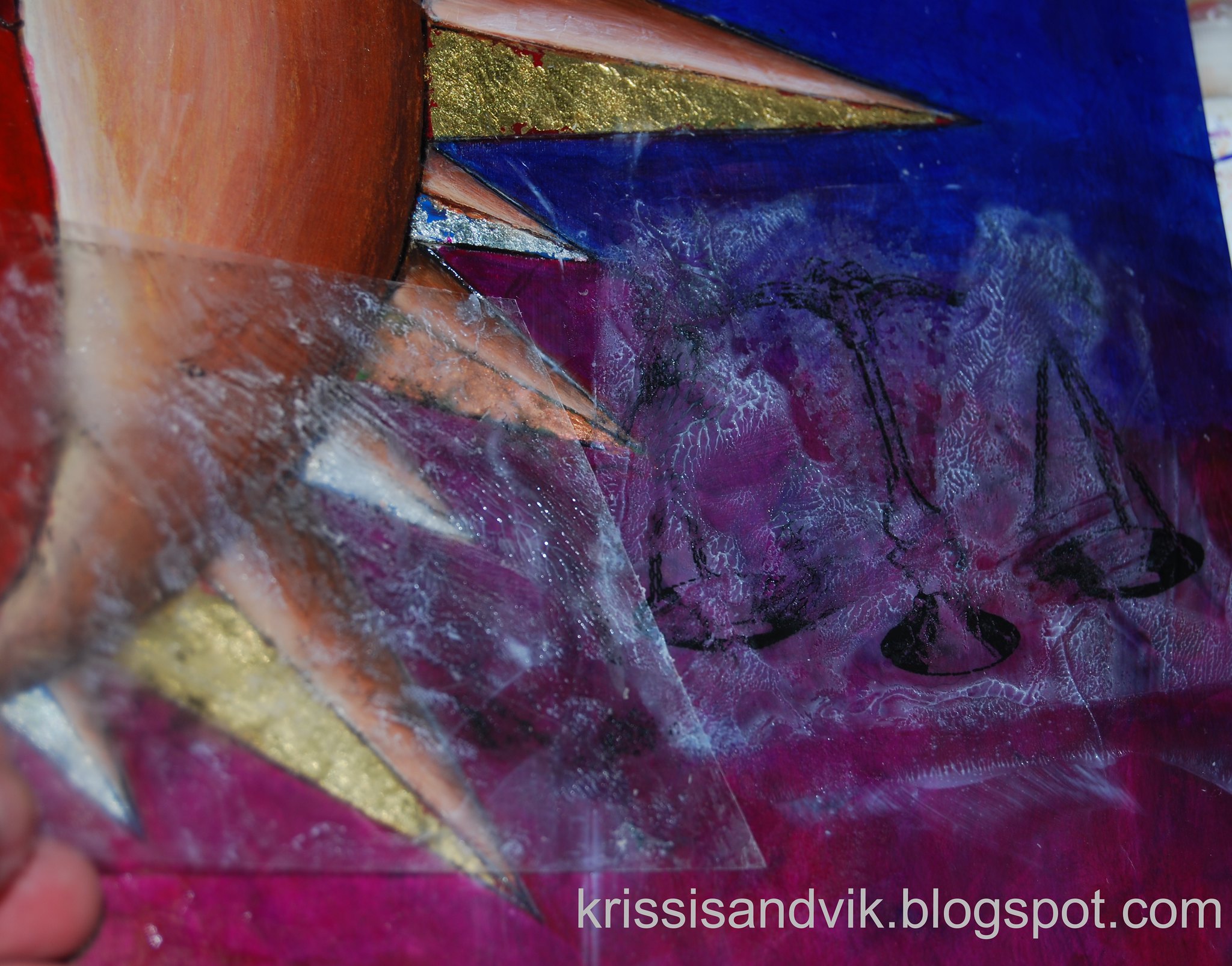
Remove the plastic sheet.  After you have let the product set for about 5 minutes (more or less, depending on your substrate and amount of medium you used), carefully begin peeling up one corner of the plastic film.  
Allow the image to dry completely before you touch it or attempt to seal it.
If you apply another product at this point, you will smear your transfer very badly.
Even with the extra medium, the transfer came out a little sharper than I
wanted, so I removed some of the ink with a baby wipe before it was perfectly dry.
After the polymer medium is completely dry (clear and dry to the touch), it is ready for the next layer of paint, product or sealant!

Work in progress with packing tape transfers, direct (paper to substrate) transfers, stamping
stenciling and, of course, inkjet printer transparency transfers.
BTW, I think the piggy banks with funny glasses lend a touch of class to the studio.

This technique isn't limited to black and white images, either!  You can do full color transfers onto watercolor paper or canvas, which turn out really well.  Experiment!  Have some fun!  Don't worry about being perfect.  

With love until next time,

Krissi - your image transfer whore.

Read more ...

Saturday, February 25, 2012

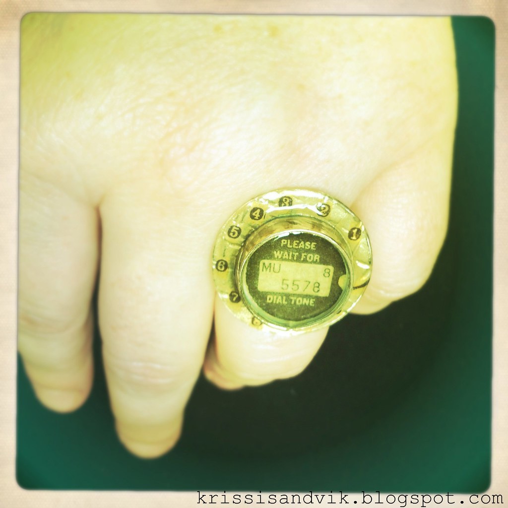
Telephone Ring (get it?) A Resin Tutorial

As I'm sure you all know, I do not fancy myself a jewelry designer by any stretch of the imagination, but I do love to make wearable mixed media art now and then.


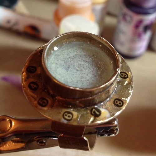
When I started working with this ring blank from Susan Lenart Kazmer's Art Mechanique line, I intended to do layers of tissue paper, resin, rub on decals, watch gears and clear mica pieces, but once I started looking at the 7 Gypsies tissue paper I'd just purchased, the project took on a life of its own.

What you'll need for this project:
  • Ring blank - this one is the ring bezel in bronze from the Art Mechanique line by Susan Lenart Kazmer - the flange around the edge was an integral design element.
  • Numbers - I used 7 Gypsies Collage Tissue in "Numero", however, you can easily create your own numbers using a tape transfer technique and images of telephone dial numbers or old typewriter keys.
  • Resin.  I prefer 2-part jewelry grade epoxy resin with a 1:1 mix ratio like ICE or Luxe, both of which I use.  Make sure you have plenty of measuring cups and stir sticks.
  • Clear-drying adhesive or sealant/varnish
  • A steady hand  try practicing by playing some Operation with your little brother.
  • Tools:
    detail paintbrush or bamboo skewer
    sharp, small scissors
    something to hold your ring level
  • Acrylic craft paint (optional)
As always, start by opening all of your supplies and by cleaning your ring.  I just use a little 90% rubbing alcohol.

When you are working with a deep bezel in a bronze or dark color like this, layers will show up better if you start with a brighter background.  I just dabbed a little paint (I had Golden's Fluid Acrylics in Titan Buff on hand, but you can use any light colored acrylic craft or artist's paint).  

While you wait for the paint to dry...

Don't sneeze.


This was definitely the most difficult part of this project - cutting out the tissue paper and NOT blowing the teeny pieces across my worktable.  I used a very sharp pair of spring handled Fiskars snips, which made cutting the delicate tissue without tearing much easier. I think it was worth the effort though, because the sepia tone of the paper blends well with the bronze of the ring blank.  


Before we go crazy gluing things all over the place, let's take a look at an actual rotary phone.
Those of you under 30 probably didn't have one of these in your house.
magnifying glass is double plus good
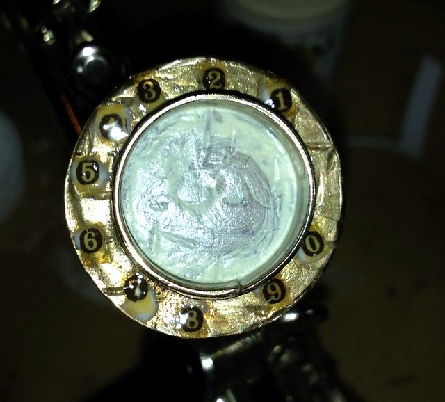
If you look at this like a clock, you'll see that the 3 and the 2 sit right on either side of 12 o'clock and the 8 and 9 sit, similarly, on either side of 6 o'clock.  I know you're already noticing that the 5 and 6 are right at 9 o'clock and the 4 and 7 sit in the space left between (the 1 and 0 just drop in line).

I started off at the top of the "dial" with some glue dots to mark where the 2 & 3 would go.  

I affixed the first two numbers (picking them up with a dampened/blotted detail brush) and tacking them down with some clear sealant - just enough to keep them from 'floating' around when I put down a layer of resin later.  Then I moved to the 5 & 6 and then the 8 & 9 before placing the other numbers.

By dotting clear sealant over the top instead of my usual silicone glue, the tissue paper took on a "wet" appearance and blended in with the bronze of the ring bezel even better.  

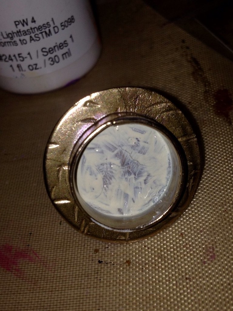
While the numbers dry, I'm going to bring the base of my bezel "up" by adding a layer of resin.  

But first, a word on using resin:

Mixing resin isn't as difficult (or as stinky) as it used to be, but there is definitely a trick to doing it well.  I always try to work on a dry day - cold and rain don't mean that I can't pour resin, but it makes it that much more tricky.  The MOST important rule - and it is a rule - is to follow the mixing ratio EXACTLY.  Resin is not something you can just eyeball.  It's best to mix an ounce at a time, but since I use resin in small amounts, it's not always cost effective.  However, the smaller your batch, the more perfect your measurements need to be.  

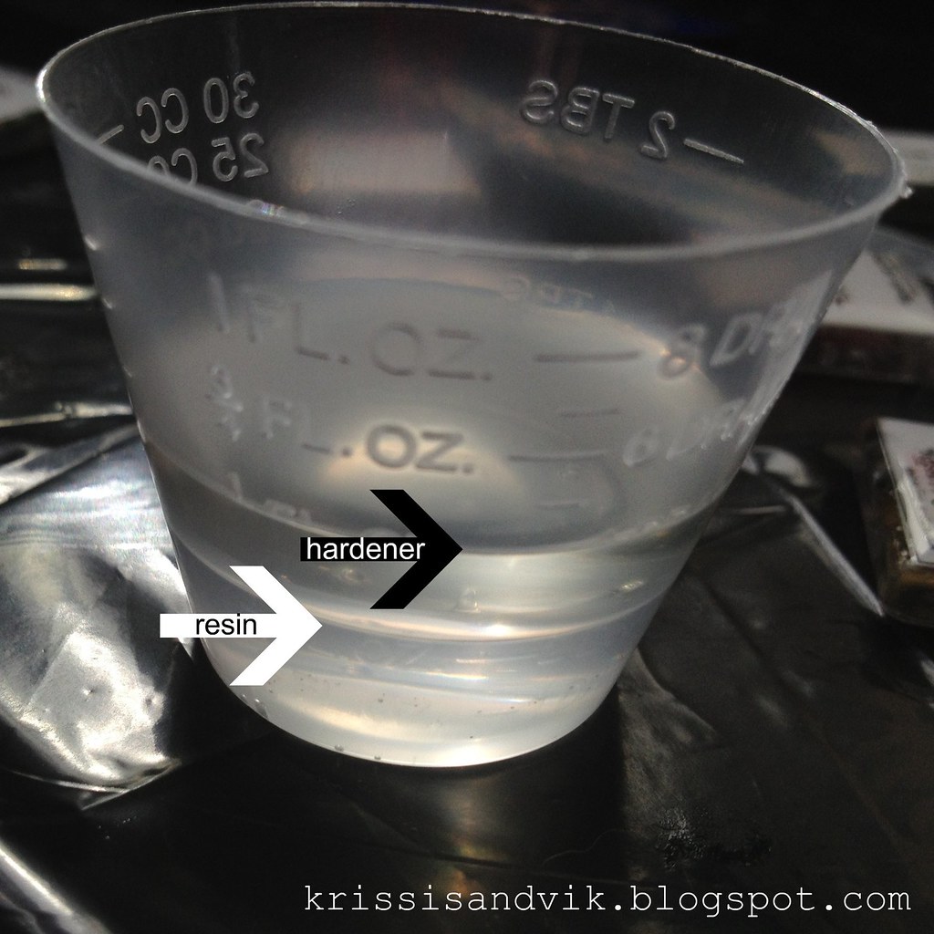
Add the resin first, adding drop by drop and letting the product level out between drops, until you reach your measurement exactly.  In this case, 2 drams or 1/4 fluid oz.

Add the hardener next, again adding drop by drop until you reach the correct proportion.  Since this resin has a a 1:1 ratio, I want EXACTLY 4 drams or 1/2 fluid oz.

Once you have your resin measured out, you can begin mixing.  I've found one of the best tools is a plastic palette knife - they're plentiful and easy to clean off with rubbing alcohol and a paper towel.  Unlike popsicle sticks, they are not porous and are not going to hold any humidity from the air (I learned this tip from jewelry designer Barbe SaintJohn, who uses a metal knife, and it has been a life saver).

I mix the two elements together by scraping the sides of the cup slowly and stirring gently for about a minute or so until the mixture turns from cloudy to clear.  I don't worry too much about bubbles, they usually work their way out before I get to the piece.  After mixing, I pour the resin into a clean mixing cup -a tip I learned from Annie Howes- being careful not to scrape the resin off the sides or bottom and screw up my nice homogeneous mixture.

At this point, you can release some of the bubbles by letting the resin rest for a minute, then tap the cup firmly on a table or other surface.  

For small pieces like this, I just drip the resin into the bezel using my (cleaned) palette knife - you can control the amount of resin much better than by pouring directly from the cup.

You'll have plenty of extra resin, so plan ahead to do something with it.  I coated some of my little handmade magnets with what I had left over from this batch.  

Let this cure on a level surface overnight before moving to the next step.


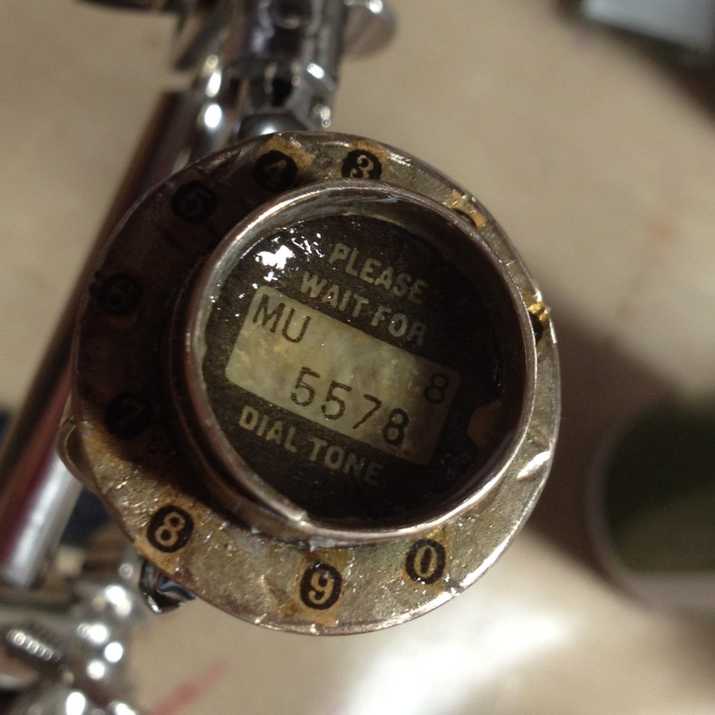
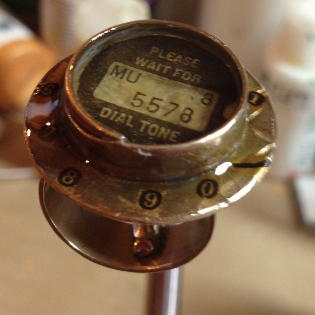
This little center piece, which just happened to be the same size as the bezel, is what changed the direction of this piece - I realized while I was dry fitting it the first time, that this would make a fun "telephone."

Like the numbers, I affixed this piece of tissue paper to keep it from rotating or curling when I apply resin later.  I used a clear sealant instead of glue - making sure that the unprinted portion of the tissue looked nice and evenly translucent.


I cut the tip off of a larger "5" to
create a dial stop.  Clever girl.
Once the sealant is dry, mix up another batch of resin and place your ring somewhere so the bottom is level.  You don't need a fancy fly-making rig like I have - just put a couple of popsicle sticks over a cup and place the ring on top.  Voila!

Apply some resin around the edge, over the numbers and out to the edge.  Next, use your palette knife to drip resin into the bezel.  You could repeat the layering process and add another element in at this point, but I decided to pour the resin right up to the top of the bezel so it will dome nicely.

You can also bring any bubbles to the surface with a heat gun on low or a hair dryer, but be careful, especially if you've filled the bezel to the top.  

Allow your piece to cure for 24 hours before you move it and 3 days before you wear or ship it. I won't be shipping this one anywhere.  I love it and am keeping it for my very own.

Crafty love,

Krissi

p.s.  Please ask questions if you have any in the comments here - if I don't know the answer, I'll find out or make something really convincing up.


Read more ...

Sunday, February 5, 2012

Marketing Tidbit: We Want IN-formation! (You won't get it!)

I'd apologize for the über geeky reference in the title, but let's face it.  We all know I'm not sorry.


I received an artist call the other day.  It was forwarded to me by a friend of mine, who received it from a friend of a gallery owner.  The theme fit one of my paintings perfectly and I was very excited to submit a piece to a gallery I had never worked with before.  Word of mouth is a great way to find out about shows, don't get me wrong, but I just spent an hour trying to track down information on the gallery.  By the time I finally found a useful link, I was almost past caring.  Almost.

So, here are a few tips to folks helping to promote shows.  Whether you represent a group or gallery or, in this case, are a friend trying to spread the word to help out, you must include as much of the following information as you can gather.  If you don't, you're doing your gallery/friends/artists a real disservice because the best and busiest will give up.

Name of the gallery - Use the full name (i.e., Joe's Gallery or Joe's Art Palace or whatever - not just "Joe's").  When you provide the name, please make sure it is spelled correctly.  One of the reasons I couldn't find this gallery was that I only received the first name and it was misspelled.


Location - It's nice to know where the gallery is, generally speaking.  If you are forwarding information from a small group where everyone knew the location, add that little tidbit of info on when you forward.  It helps (especially when other information is missing and one can't simply Google for a quick answer).

Theme - It's no fun to submit a painting and find out after you spent time on the application that there was a theme.

Deadlines & Timelines - That's pretty self explanatory.  When is the show?  When must the art be delivered?  Is it a one-night show or a month long commitment?


E-mail addresses and links - please make sure they are correct.  Links are always better than e-mails since an artist, if they're worth their salt, will find out what they need to know about a show before they bother the curator.  The link I followed today went nowhere.

Basically, if you're going to help your friends by promoting their gallery or shows, you need to provide the above information or provide information that will lead people quickly and easily to that information.


You know what else we need to talk about?  How an artist should approach a gallery/show.  Yep.  That's on my list for the next tidbit.


See all the Marketing Tidbits
Read more ...

Thursday, December 8, 2011

A Not-Really-A-Tutorial (Glass & Resin Jewelry)


"Inchie" pendant (1" square)
People ask me what procedure and techniques I use to make my glass tile and resin jewelry all the time.  The reason I haven't done a tutorial isn't that I am playing my pendants close to my chest, as it were.  It's just a super, duper involved process and I've never stopped to photograph each step as I go.

However, since this question has popped up again recently, I'll give you the 30-second version (sorry, no bunnies).


* print art and titles for backs (I use an Epson printer and Epson matte 27lb presentation paper)
* spray art with fixative
Seriously, the resin has to be
EXACTLY 50/50
* cut art and title pieces into itty bitty squares
*  glue art to glass tile (art faces glass tile)
*  glue title to back of art
*  seal title piece AND EDGES with silicone sealant
* wait for dry time
* clean edges of glass
* mix resin PERFECTLY
*  run resin around edges
* wait for set/cure time (overnight)
*  apply resin to entire back
If I do the resin all in one step, it "domes" and pulls away from
the edge, leaving a spot where moisture can seep under.
By running a bead of resin around the edge, allowing
it cure and then applying to the back, the art is fully protected
(but I still don't recommend you shower or swim while wearing your jewelry!)
*  stare at pieces for 48 hours to a week, depending on temperature and humidity
* quality check (toss or send back to "resin edges" stage)
* clean and polish
*  glue on bail
*  package in box with chain, care instructions and goodies
*  pack
* mail
*  pray that the USPS comes through

fin

Read more ...

Monday, October 31, 2011

Marketing Tidbit: Make Packing/Shipping Easy

Today's Marketing Tidbit is a 2fer since I've been gone for so long.

First, some organization: I've tried going off memory to make sure that everything I want to go into packages actually gets in there.  I fail every time. - luckily, the item that usually gets left out is the invoice (annoying, but not critical).  I think it's because I don't ship a high volume of stuff, so I haven't developed habits from constant repetition.  I finally broke down and admitted I needed a system, so I made myself a checklist.
Click on the image to be taken to the Google Docs checklist.
Now you have a checklist too!

The "Linky Love" packet, for those of you who are wondering, is a little envelope of goodies and business cards from shops I buy from, work with and love.  Cross promotion between shops is a FABULOUS idea, but don't just throw your friends' cards in the package, tell your customer why you are sending them.  The wording on my note goes something like this:


There you go, two treats and no tricks!  Happy Halloween, everyone!


See all the Marketing Tidbits
Read more ...

Thursday, October 6, 2011

The How-To on How-To's Part II (Writing Style)

Here we are at part 2 of my how-to on how-tos.  By breaking this tutorial-writing tutorial up into sections, you have a little more time to focus on each aspect of writing a good tutorial before I throw the next bunch of information at you.


Last time I covered the importance of using photos in your posts (feel free to review that before we go on, I'll wait), so that brings us to:
PART II: WRITE CLEAR, SIMPLE INSTRUCTIONS
Intro: The purpose of publishing tutorials is, in short, to help people.  Admittedly, tutorials are also a great marketing tool with which to showcase your knowledge, writing style and/or craft, but if it doesn't teach people how to do something, then it has failed at being a tutorial.  If you're writing for yourself, or if your audience is unable to understand you easily, your time would probably be better spent elsewhere.  Harsh.  I know, but there you have it.

Use a structured format. I dig literature. I have a love for Joyce's stream of consciousness literary style and the long, meandering story-telling of American writers from the Deep South.  However, rambling in a tutorial makes me click away quicker than green grass through a goose. True story.  Have you ever wondered why I use bullet points so often? Outline formatting is a habit I picked up from my years of writing licensing contracts and doing regulatory analysis. It works so well for instructional writing that I use it often in my posts.

An outline format:
  • is easy to read
  • stands out on the page - it says "here are the instructions!" and 
  • makes referring back easy; your reader won't have to scan through long paragraphs to find information
  • serves as a checklist when printed out
Write simply.  Don't plan on getting mileage out of your fancy vocabulary in a tutorial. Instructions are difficult enough to follow without making readers stop to look up words like "contiguous" (just say "next to each other").  If you choose the simplest, most concise words to describe what you're doing, your tutorials will reach a wider audience base.  People will also make fewer mistakes (read that as "get less frustrated") which means your popularity as a tutorial writer will grow.

Be conversational.  You aren't writing a scientific research paper for publication in the Journal of the American Medical Association, so you should feel free to engage your readers in conversation.  Heck, use  colloquialisms (well-known expressions or slang) or crack a joke every now and then; nobody is going to rap you on the knuckles with a ruler for goofing off in class.

Here is a trick I used in college when I was a writing tutor: try reading your instructions aloud.  Do they make sense?  If you find yourself tripping over sentences or words, revise those parts. Whenever I read my tutorials to my husband, I edit as I go.

Use proper grammar and punctuation.  I cannot stress this enough.
Not sure about proper punctuation?
Periods and commas are
nothing to be ashamed of.
  1. Colloquialisms and jokes are great, but never use LOLspeak, SMS or texting abbreviations, leetspeak or any other form of un-grammar in a tutorial (exception: if you are writing a tutorial on technology-based "grammar").  If you use any "txtese" in your tutorial, 
    • Best case scenario: you exclude anyone who doesn't understand what you are saying.  Why bother writing a tutorial if most people can't or won't read it?
    • Worst case: you come across as irritating, uneducated and/or too lazy to write a sentence.  Yipes.
    • All the squiggly red lines under your abbreviations are going to distract you from the other spelling errors.
  2. Spelling is pretty easy to check with a spell-checker, assuming you haven't used the wrong version of a word like "then" instead of "than."  Common grammatical errors, I'm sorry to say, will also turn off many readers.  If you are unsure about when to use "its" and "it's" (that's a confusing one, too), just do a quick search on Google.
  3. My current pet peeve is misuse of the ellipsis (aka "dot dot dot").  These should be used only when something is left out of a quotation or is intentionally left unsaid.  If you want to pause, try our old friend the comma or live wildly and start a new sentence.
    Ellipsis have three (3) periods "..." (a fourth is optional, but only at the end of a sentence).  Adding an extra 12 in a Facebook post might be cute, but in a tutorial, not so much.
  4. Use a reference book.  OK, this is for the hard-core of us out there, but it is an option. Most people have thrown Strunk & White to the wind in preference of On Writing Well, but my favorite is The Deluxe Transitive Vampire.  It's funny, helpful and it makes a great conversation piece when people see it on your bookshelf.  People ask me about that book more than they ask about my gigantic O.E.D. (acquired in ye olde pre-internet days).
  5. And the simplest tip: have someone read your work or proof it the next day with fresh eyes.
Sure, you could go with Elements of Style, but
why would you want to? This is so much cooler!
I know, you're probably shouting, "Krissi! This post is chock full of rules to remember!"  Well, don't get too panicky about them. Just work on communicating what you want to say in the simplest manner possible.  Pretend you're having a conversation with someone and avoid the temptation to fancy up your language to "sound like writing" or to use punctuation you aren't sure about.  After that, just proof it with fresh eyes (yours or someone else's) and go for it.

Next time:  Links!
Read more ...

Wednesday, October 5, 2011

The How-To on How-To's Part I (Photos)

I was recently named "best tutorialer on the web" by my friend Rachelle Rose.  OK, so it's not a REAL award, but dang it, I think I do write tutorials pretty well.  Once I finished patting myself on the back for that major award, I realized something.  If I am so great at writing tutorials, I should probably write one on how to write tutorials.  And so, here we are.

I've decided to turn this into a series, rather than throwing it all at you at once.  This way, I can spend a little more time going through and fleshing out or editing the sections for you, and you get a little more time to focus on each aspect of this how-to how-to.  Here's what you can expect me to cover (I may throw in other stuff as we go):


PART I.  USE PLENTY OF PHOTOS

It doesn't matter whether you're writing about crafts or Photoshop basics, people need to actually see what you are doing.  The trouble with blogs is that the written word often causes misunderstandings - the great thing about blogs is that you can embed pictures!
Tape Transfer tutorial
BONUS: I've had HUNDREDS of hits on my image transfer
tutorial as this photo keeps being "pinned"and "repinned!"
Document your process.  Take photos (or screen shots) of each step, technique and process. If you have trouble identifying at which stage to take each photo, volunteer a friend and teach them how to use/make your product/project and every time you say "and now you..." have them take a photo.   I also like to include a shot of supplies or the setup and a shot of the final piece.

"Tijuana Makeover" from woodburned outline
to finished mixed-media painting
Give a visual timeline.  Consider editing your photos together into a collage to show your process.  I've had great success with Mosaic Maker by BigHugeLabs using the photos I uploaded to my Flickr account, and I've also created my own using photo editing software.  It's pretty easy and it REALLY helps people to see everything at once.

Point out the little things.  Let your inner "John Madden" out - use your editing software to label details.
You may be able to pick out the details clearly, but
someone new to your process may not - help them out
Make use of the photo captions.  Even if you're explaining everything in the text, pop a little something into the caption that will lead them back into the tutorial.

Now that you know how to use the photos in your post, here are a few tips to keep in mind when you are taking your photos:
  • make sure your lighting picks up the details you want to show (avoid the temptation to "white out" your photos with overexposure)
  • the area being photographed should be uncluttered (and free of pet hair, etc.)
  • use a solid color background to avoid distractions (and please, don't use your bedspread)
  • leave the artsy-fartsy stuff-on-books pictures for your Etsy listings; they have no place in a tutorial
  • crop your photos and adjust the brightness and contrast, if necessary, but don't give your photos an over-processed look or mess with the depth of field (see above)
  • take more pictures than you think you'll ever need, then take a few more

I hope this series becomes a helpful resource for you all.  

If you have a question about writing tutorials, please post a comment here or in any future installments of this series.

Next time: writing style


Read more ...

Tuesday, September 27, 2011

Marketing Tidbit: Make 'Em Put A Ring On It

Winter art and craft festival time is FAST approaching, so this little tip is for those of you gearing up for the crazy weekends to come.

You've probably been there - you're at a festival or art/craft fair and a customer asks you to hold an item, ostensibly to find their husband/wife/holder of money.  You want to make the sale, but you know there's a very good chance of them never returning. Festival-induced ADD is the main reasons I would never hold items for people.  There's nothing more frustrating than turning down the next customer who wants that item - except maybe being the next customer who is turned away! Chances are you won't be seeing them again, either.  

My new-found collague, Kattaztrophe Arts' has a simple, but brilliant solution:  include a small deposit in your hold policy.   Base it on a small percentage of the price of the item, which is refunded/applied toward the final cost.  With a deposit in your coffers, you don't completely lose out if the person doesn't return.  I think you'll find that anyone who refuses to pay a deposit wasn't really interested and those who do will come back more times than not.  If they don't have cash on them and they really want the item, they'll move pretty quickly to find their other half!

Here are some extra Krissi-tips on the side:
  • post your hold policy and deposit requirement (with amount or %) - never make people ask
  • remove any item on hold from public display immediately (don't tease customers with what they can't have) 
  • keep order forms on hand and have a proper system for accepting customer orders (with payment or a deposit, of course)

Read more ...

Friday, July 22, 2011

Stuff (Without Which I Would Surely Perish) #2 - Sealant for Resin

Wow.  It's been a LOOOONG time since the first installment of Stuff (Without Which I Would Surely Perish) - over two years, as a matter of fact!

The Project:   In the last year and some months, I've started creating jewelry with the images from my paintings.  Like prints, jewelry is a way for my clients and fans to have the images they like which they can also afford. As an added plus, you get to carry them with you.  I arrived at my current art-jewelry techniques following a two-year long process of experimentation with various adhesives, sealing agents, papers, printing inks and substrates.

Some resin leaked into the paper on the right earring
leaving it looking permanently water-stained
The Problem:  When I started using 2-part resin, I was dissatisfied with the outcome because it tended to bleed into paper, leaving a permanent 'wet' mark.  For example, these Skelekitty Angel/Devil earrings:
(here's another example from a resin artist's blog)

Everyone I spoke to or read either said to seal my images with packing tape or Mod Podge ... and both of those products failed at irregular intervals (usually when I was doing a custom and didn't have more tiles on hand).  I refused to list items at full price that were 'imperfect' in my eyes and figured there HAD to be some kind of sealant that wouldn't make the paper look wet or spotty when applied, and that would not be dissolved or penetrated by resin.

The Solution(s):  Then one day I realized what I was looking for - SILICONE!


Nunn Design makes both a silicone sealant and adhesive that work PERFECTLY with resin applications.  So perfectly that I'll never ever go back to using anything else.  I completely coat my image with the Nunn Design Sealant (painting in a cross-hatch motion) on both sides AND the edges of the paper before I apply the image to my wooden or glass tile using Nunn Design Glue.  Both products clean easily with a little water, but once they are dried, they will prevent moisture from seeping into your image.  TA DA AND HOORAH!

A quick Google search for either of these product names will bring up a list of online suppliers.  Even some local bead shops are beginning to carry these products, though I recommend you don't even bother looking in the big box craft stores.  I usually order my glue, sealant and resin* from ArtBeads.com - their prices are good and their customer service is excellent.

To see other products I love, click on the 'product faves' tag over there on the sidebar (or at the end of this post.  Keep your eyes peeled for my SWWIWSP post on ICE Resin.


Read more ...

Sunday, April 3, 2011

Color Theory for Non-Artists Part IV - Complementary Colors

Back in February, I started a blog series to help my makeup followers and fans to get a little bit of an artist's eye for pigment colors.


In Part I of this series I talked about the color wheel and even built one of my own from my mineral makeup collection so you could see the spectrum in action.


In Part II, we looked at small chunks of the spectrum around the wheel - colors next to each other on the wheel called analogous colors - and showed how they are great combinations for people just starting out with colorful makeup.


Part III covered hues, tints, tones and shades or, simply, what happens when you add black and/or white to colors.  I showed a technique for an easy but pretty effect using one color and adding black/white to make tints, shades and tones, as well as one using different colors to achieve a 'light to dark' look.


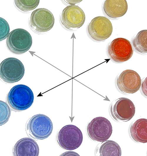
In this portion of the series, I want to tell you about "complementary" colors (not the same as "complimentary" - they're not wandering around telling you how awesome you look in your new hat). In terms of color theory, complementary colors are defined as those that, when mixed in the correct proportions, yield a "neutral" (white, gray, brown or black). I know that's tough to understand unless you're mixing paint colors, so let's look at the color wheel: complementary colors are those that lie opposite each other on the wheel.
Primary/Secondary Complementary colors (Madd Style Cosmetics)
yellow (Princess Buttahcup - disc.) and violet/purple (Electric Kool Aid - disc.)

Primary/Secondary Complementary colors (Madd Style Cosmetics): orange (Boognish) and blue (Aja - ltd. ed.).

Primary/Secondary Complementary colors
 red (MAC ltd. ed. non-vegan red) and green (Madd Style's Zombie Crush - disc.).
So the fact that complementary colors are "opposites" can work both for you and against you.  The inherent contrast between complementary colors makes a strikingly awesome effect.  However, remember up there where we talked about complementary colors mixing to make neutrals (black/brown/grey)? That means if you over-blend contrasting colors, you get something that looks very muddy. Blech.

My suggestion is to stay away from trying to blend or mix complementary colors over each other until you get the hang of it. In the meantime, try using one of these techniques:

♥ Use one color on the lid with its complement on the orbital bone separated by a transitional color (or black) in your crease, like I did with this look:
I separated the green (Ecto Cooler & Frankenstein) from the pink (Magenta)
by adding a little bit of black pigment (Time Warp) in the crease
(pigments by Madd Style Cosmetics)
♥ Use one color on the lid (yellow) and the complement as a liner (purple):
The sharp line of the purple pigment used wet (Electric Kool Aid - disc.) over the dry yellow
(Princess Buttahcup-disc.) keeps the complementary colors from mixing unintentionally
(and again, I used a neutral in the crease to transition the yellow to the purple/pink and again, it's all Madd Style)

♥ Use Danielle's favorite technique for complements - the "cut crease:"
Danielle's "orange and blue" complementary color look with Madd Style Cosmetics' "Dark Crystal" in Citrine (lid) and Sapphire. See more of Danielle's looks at http://genericwhore.blogspot.com

Once you get good at blending techniques, then you can lay the colors down next to each other and create a soft "fade" between the colors without mixing them together (remember? muddy.).
This look could be duplicated with Madd Style Cosmetics' pigments in
Pop Tarte (matte yellow) and Shana (if you got the Jem and the Holograms Collection!)
Just don't forget that complementary colors, when mixed, will turn very muddy (but you can always save your look by adding a little black in the crease!).

You can also use a color with one or more of its "split complements:"
"Split Complements" are a color (purple) and a color *analogous* (next to) its complement. Orange/yellow-orange are analogous to purple's complement (yellow). My favorite color combo, green & purple, are split complements of each other (technically, green/orange/purple are called a "Triad," but for makeup purposes, we don't need to be so specific)
In this look, I used purple with its split complements, green and orange:
Split complements orange (Strange Potion), green (Frankenstein) & purple (Mondo) all by Madd Style.
This Bollywood-inspired look started off was based on orange and its split complements purple and teal (blue green):
"Outsourced to Nirvana" featuring Madd Style Cosmetics Madd Piggiez
Orange (Strange Potion), pink-to transition (Peep Show), purple (Mondo), black-to separate (Oogie Boogie), teal (Nirvana) and a slightly different teal (Ol '55) under lower lashes
Take a look at the Wheel O' Piggies again and then look at your makeup collection. What are some of the colors you have and their complements?  Their split complements?


NEXT: Part V - Mixing It Up!
Read more ...