Without a doubt, my packing tape image transfer tutorial is the most popular post on this blog. Now, after more than two years, I bring you the inkjet transfer version!
This is a fun, relatively clean and VERY quick way to transfer digital images onto your canvas/wood/paper surface - or any flat surface really, assuming you prep and seal it appropriately. It's pretty easy to do with just a little bit of practice too.
What you will need:
Apply the liquid acrylic medium. Paint some of the fluid medium onto your canvas. How much acrylic medium you apply will depend on the porosity of your substrate. You want to use as little medium as possible, which still making sure that all of the image is completely moistened.
Read more ...
This is a fun, relatively clean and VERY quick way to transfer digital images onto your canvas/wood/paper surface - or any flat surface really, assuming you prep and seal it appropriately. It's pretty easy to do with just a little bit of practice too.
What you will need:
- inkjet overhead transparency film
- an inkjet printer I swear by Epsons, but this technique can be done with any brand
- paintbrush (firm/for acrylics)
- gloss or matte fluid medium I use Golden Artist Acrylics Polymer Medium (gloss) and Matte Fluid Mediums interchangeably.
- scissors (to trim image)
- baby wipes (optional easy cleanup)
Choose an image. Be sure you are using an image without copyright restrictions - even if you aren't selling your work, it doesn't mean you can use a copyrighted image. Likewise, just because you purchased a printed image, it doesn't necessarily give you the right to reproduce it. Look for very old graphics or images with a creative commons license that matches your purpose. If you aren't sure, ask; if you can't ask, find another image. NEVER use another artist's work without permission (especially if it's mine, heh).
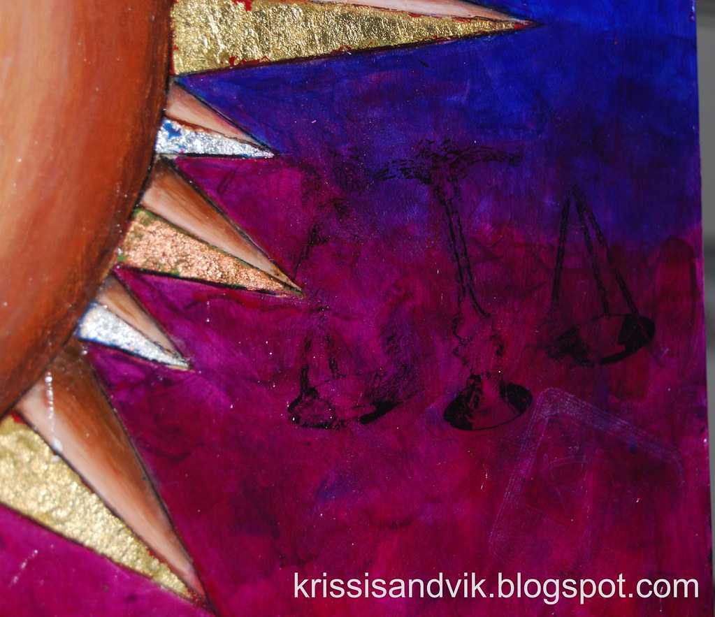
Prepare your image. I am using this black and white of a balance scale for my current painting. Print your image onto the inkjet transparency film's rough side. The rough side is coated with a substance that grabs onto and holds the ink and which will be transferred onto your artwork. If you print on the slick, uncoated side, you're going to end up with a smeary mess. Trim out the image you want to transfer.
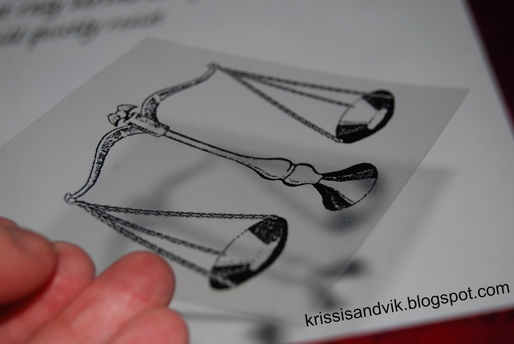 |
| If you look closely, you can see the coating on the plastic film (it looks and feels a little like etched glass) |
VERY IMPORTANT NOTE: you will be "flipping" or reversing the transparency onto the surface, so it will appear mirrored. If the image you have chosen has text or anything directional in it, you will need to set your printer to mirror print, or edit your image before printing. As it is, this balance scale is ... well ... "balanced," so I don't need to do that here.
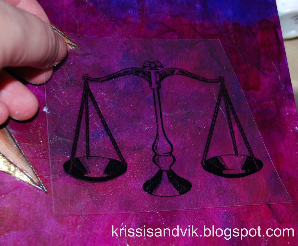 |
| I always do a quick dry-fitting before sticking anything down! |
Apply the liquid acrylic medium. Paint some of the fluid medium onto your canvas. How much acrylic medium you apply will depend on the porosity of your substrate. You want to use as little medium as possible, which still making sure that all of the image is completely moistened.
Since I am working on pre-painted wood with a layer of dry gel medium on it, the substrate will not absorb much, if any of the acrylic medium. If I were working on unfinished wood or watercolor paper, both of which are more absorbent, I would need more medium.
If you use too much medium, the inkjet coating will break down and your transfer will blur (see below). If you use too little, you will not have contact between the coating/printed image and your substrate. Getting it right takes practice.
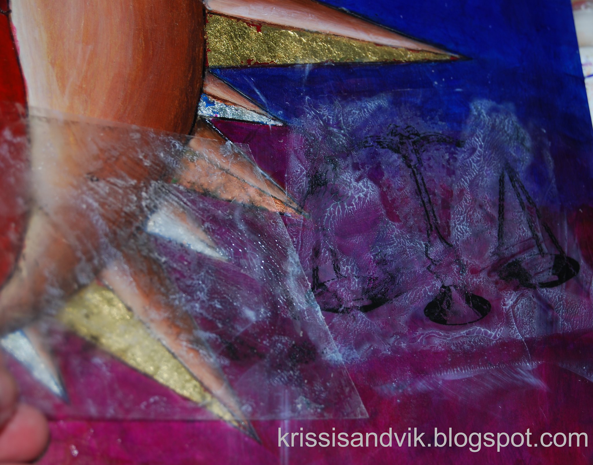
Apply the image. Place the image, printed side (rough side) down onto surface coated with a thin layer of acrylic medium and press quickly and gently to remove any air bubbles from under the printed areas.
 |
| Work quickly and don't press too hard of "burnish" the image. |
 |
| This transfer had a little too much medium on the left and was overworked on the right. Once the inkjet coating is fully wet, it breaks down under the slightest pressure. |
Unless you're like me and like the "distressed" look, it's better to go with too little fluid medium and miss transferring some of your image, than to go with too much and blur. If some of your image doesn't transfer the first time, you can always go back a second time to transfer any missed bits later (kind of like a rub-on).
Remove the plastic sheet. After you have let the product set for about 5 minutes (more or less, depending on your substrate and amount of medium you used), carefully begin peeling up one corner of the plastic film.
 |
| Allow the image to dry completely before you touch it or attempt to seal it. If you apply another product at this point, you will smear your transfer very badly. |
 |
| Even with the extra medium, the transfer came out a little sharper than I wanted, so I removed some of the ink with a baby wipe before it was perfectly dry. |
After the polymer medium is completely dry (clear and dry to the touch), it is ready for the next layer of paint, product or sealant!
 |
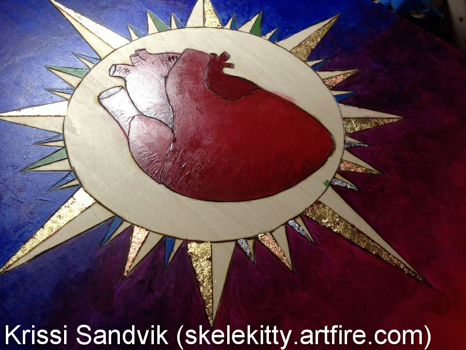
| Work in progress with packing tape transfers, direct (paper to substrate) transfers, stamping stenciling and, of course, inkjet printer transparency transfers. BTW, I think the piggy banks with funny glasses lend a touch of class to the studio. |
This technique isn't limited to black and white images, either! You can do full color transfers onto watercolor paper or canvas, which turn out really well. Experiment! Have some fun! Don't worry about being perfect.
With love until next time,
Krissi - your image transfer whore.